Cell Ranger Problems and Hera-T
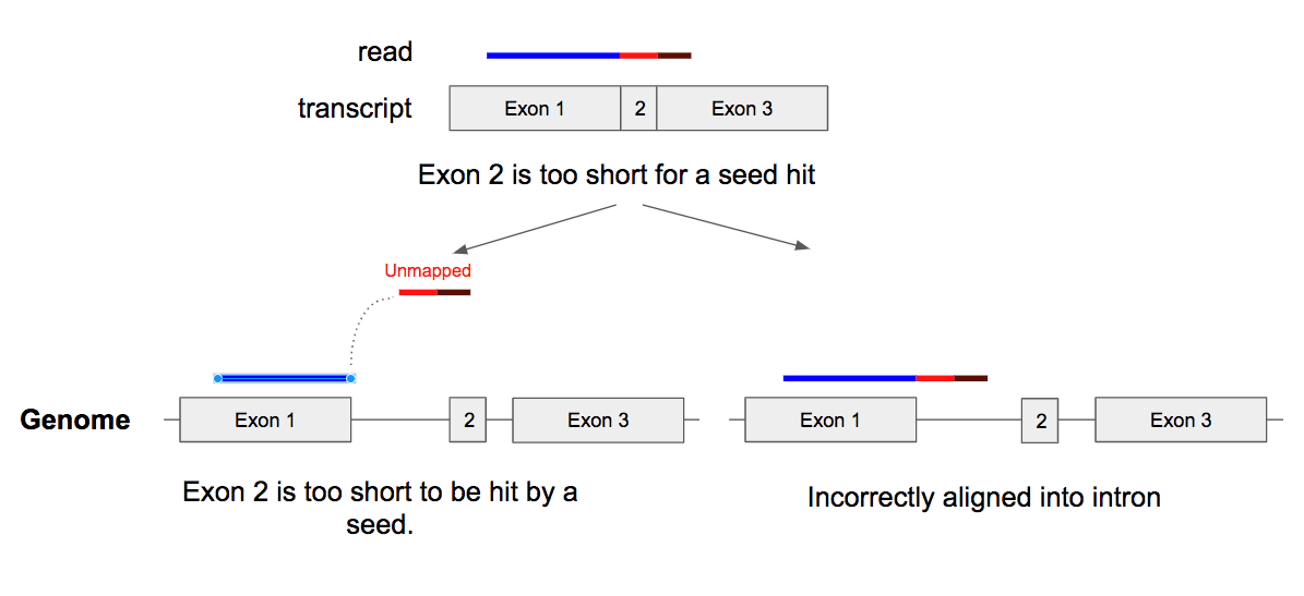
Today we finished the first version of Hera-T, a new single-cell RNA-seq quantification algorithm. We developed Hera-T by improving challenging alignment errors that Cell Ranger has. As a result, Hera-T is more accurate than Cell Ranger. Hera-T is more than 10 times faster than Cell Ranger, while consuming just a small amount of […]