
Massive amounts of biological data are emerging everyday, waiting to be deciphered. There is almost no way to analyze and visualize them without writing complex code. As a biologist, you may not find it an optimal use of your time to develop such code from scratch.
That is why we create BioVinci, a powerful yet simple tool for data analysis and visualization. BioVinci allows wet-lab biologists and biomedical researchers to process data on a familiar screen. No computational background is necessary. Just drag and drop. It’s that simple.
With BioVinci, you can:
- Customize your plots and get them ready for publication in a breeze,
- Study your data with the latest advances in machine learning,
- Run any statistical analysis, from basic to sophisticated.
BioVinci is now available in both web and app versions. Try it at: https://vinci.bioturing.com/
This blog post will guide you through the basics of BioVinci. You will be surprised at how simple it is.
Home screen
You will land on the home screen once you start the app. Here, you can import your data, access examples, and go to your previously saved and shared plots.
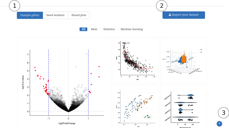
(1) Worksheet controller allows you to browse through the examples, your saved projects and previously shared plots. Figure 1 shows the example gallery tab. You can launch these examples to see how to structure and input your data.
(2) Import data button lets you manually input data, or upload the entire dataset (supported file formats include CSV, TSV and Excel).
(3) Documentation allows you to access a complete guide of BioVincifunctions.
Data input
Click Import your dataset on the main window or any plots in the example gallery.
You can upload your file (CSV, TSV, or Excel) or enter the data manually (see Figure 2). The data should be structured in a table (or matrix). For Excel and similar worksheet editors, you should clean all irrelevant titles and information, and just upload the main table to BioVinci.
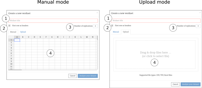
(1) Workset title: this field is required, otherwise you cannot progress to the next page.
(2) First row as headers: Check whether the first row is the column’s labels.
(3) Number of replications: If your data contain merged column labels that show replications in your experiment, you have to input the number of replications so that BioVinci can understand your data. More on this in ourblog.
(4) Import area: where you can input and edit your data
(5) Browse your file for upload: browse your worksheet if you don’t want to input data manually
Project interface
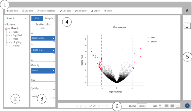
(1) The tool bar shows the available functions for your project.
- Add data: enter a new dataset apart from your current one. Your newly imported data will show up on the data panel (2).
- Edit data: edit your data
- Create variables: create an appropriate matrix that includes only some of the columns from your initial datasheet, to run statistical and machine learning functions
- Edit plot: open the edit mode, where you can customize your plot features.
- Clean plot: clear all inputs in the input panel (3) and the plot area (4).
- Save / Delete: save the current plot to the the gallery panel (5). If a plot has already been in this gallery, the button will appear as Delete
- Export: export the data in various formats (SVG, PNG, and PDF for pictures and CSV for statistic results).
- Statistical results: this button only appears when you use the statistical functions. Figure 3 shows a basic graphical function as an illustration.
- Suggestions (on the far right): you can hover the mouse over the thumbnail to see what statistics BioVinci suggests for your data, and click to apply it if you want.
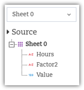 Figure 4: The data panel
(2) The data panel: show the structure of your data in terms of column labels. If no labels are given, BioVinci will set them as X1, X2, etc. The tiny figure on the left of each label shows the column type. The first two columns (Hours and Factor2) are categorical columns and the last (Value) is numeric.
You can switch to your newly created variables in the drop list (shown as Sheet 0 in the figure 4).
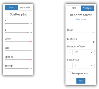 Figure 5: The input panel
(3) The input panel: drag your data from the data panel (2) to the placeholders to create plots or run analyses. The input panel is different for each function. Draggable items include columns and matrices.
(4) The plot area: This is where your plot appears. Some statistical results can have more than one plot. In this case, the plot area only shows the first plot. Users can switch to different plots using the drop list at the far left of the plot icon panel (6).
(5) The gallery panel: present all the saved plots/results of the current project. You can click a thumbnail to open a saved plot/result.
(6) The plot type icons: highlight the current plot type and show all possible plot types. You can also control the size and theme of the graphs. BioVinci has various settings that can quickly make a graph publication-ready.