When it comes to presenting data, visuals are your friend, or so we all heard. Tables are better than large blocks of text and numbers. Graphs and charts are better than tables. Then it becomes irresistible to enliven your graphs and charts with colors, patterns, grid lines, labels, and the likes. The more visual they are, the better, right?
Not quite.
There are good and bad charts. The ultimate purpose of a chart or a graph is to convey information from the data. When the extra bells and whistles don’t tell the viewers anything new, they are called chartjunk. At best, they are a harmless waste of ink. At worst, they become distractions. It is a fine line between an effective visual illustration and a confusing one.
Here’s a few tips to not fall over that line.
1. Forgo cross-hatching
When colors are not an option, we tend to go for cross-hatching. To differ among groups, we pack bar charts and pie charts with patterns: parallel lines, dense parallel lines, parallel lines that run the opposite directions… Cross-hatching has become so common in scientific graphs, you can spot so many of them on major journals.
Beware: Cross-hatching can cause the so-called moiré effects to your charts: confusing viewers with illusional movements and vibration. In other words, your charts will give viewers a headache instead of information from your data.
Cross-hatching is a prime example of chartjunk: excess ink that reveals no quantitative information. Chartjunk overwhelms your visual illustrations with unnecessary details. Edward Tufte even came up with a mathematical way to describe this: the data-ink ratio. It is the ratio of meaningful ink to total ink in a chart, and the larger it is, the better.
The ultimate purpose of a chart or a graph is to convey information from the data.
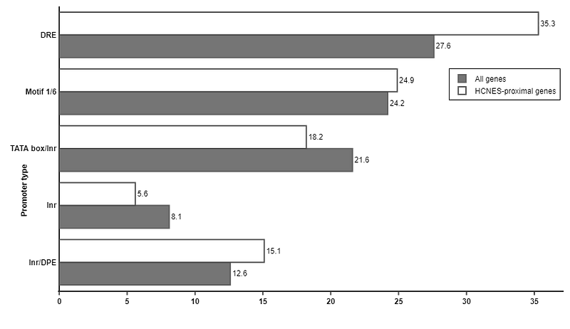
To remove junk from your charts, use alternatives that require less ink than cross-hatching but still retain the information. Like grayscale, as in the example below.

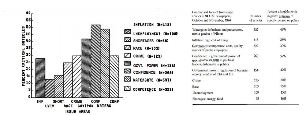
Or a table. It can present the same data without the dizziness from moiré effect.
2. Tone down the grid
The grid came from the dark old days when you had to graph your data by hand. Graph paper has printed grid lines to guide your eyes. Instinctively, now you want to use the grid when presenting a graph, too. You’d think it will help viewers estimate and compare values more easily. Instead of gearing up with a ruler, they can trace along the grid lines.
In fact, grid lines can be counterproductive: they clutter up the graphs without adding any information (and therefore are another type of chartjunk). Dark and bold grids are even worse. They conceal your data points, which should have been in the spotlight.
So, when plotting graphs, try to omit the grids if they contribute nothing. If you find grids essential, it’s better to tone them down. Thinning the grids, making them muted relative to the data, will help. Keep in mind that your data are the main characters of the entire visualization.
3. The bottom line
Charts and graphs are ways to visualize data and they should do exactly that: draw viewers’ attention into the data and their stories. Dressing them up with chunky details can backfire. Try to cut down cross-hatching patterns and go for better codings, like grayscale, tables, or plain-Jane text. Clear the grids, or have them muted if possible. Don’t waste ink on chartjunk. When it comes to creating a good chart, less is more.
“Perfection is achieved not when there is nothing more to add, but when there is nothing left to take away.”
— Antoine de Saint-Exupery.
To create better charts, try BioVinci, our drag-and-drop visualization tool. It lets you customize patterns and gridlines for more effective charts with ease. Give it a try!
Reference: Tufte, Edward R., (2001). The visual display of quantitative information. Cheshire, Conn. :Graphics Press
#goodandbadcharts