When your data span a large range, the graphs tend to get ugly. Values either crowd at the bottom or spread out at the top — a problem called poor resolution. The rate of changes is hard to display, since the graph usually has a very long tail, or a very stiff back, or both.
This is when log scale comes in handy. For example, graphs using log base 10 can simplify the values of 1, 10, 100, 1000, 10000 into values of 1, 2, 3, 4, 5, helping you recognize a stable growth, and resolve the resolution problem.
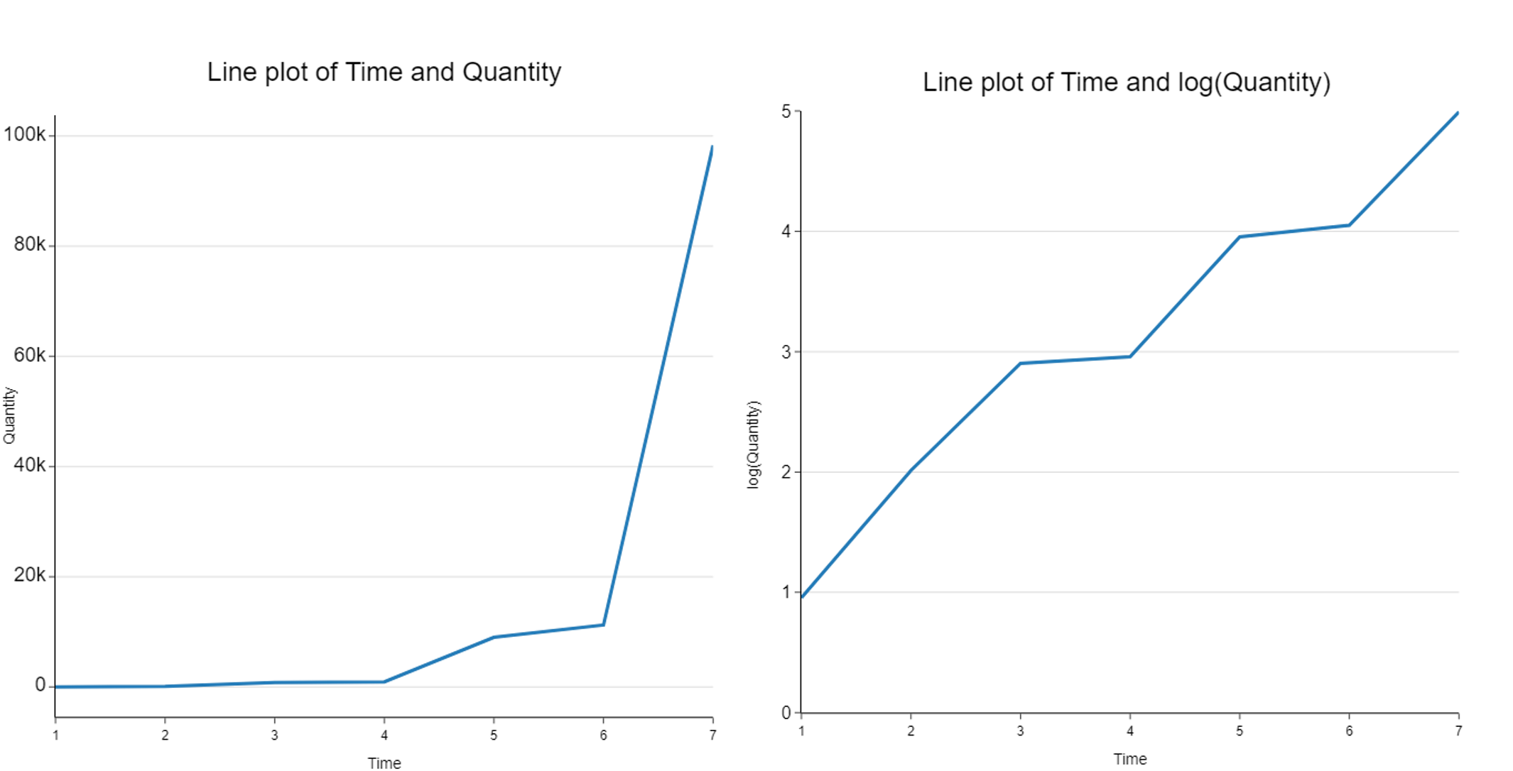
Figure 1: Graphing with normal scale (left) and log base 10 scale (right). Data values go through many powers of 10, causing the left graph to suffer from poor resolution when the data are crowded at the bottom. Resolution improves with the use of log base 10 scale, as shown on the right graph.
Okay, so you’ve decided to graph with log scale. Now what? Which base should you take the logarithm: 2, or e, or 10?
The answer lies in your data value range.
Log base 10 for a large data range
Though frequently applied, scaling by log base 10 works best for datasets that go through many powers of 10, or large percentage changes. With such data, you don’t want your plot to suffer from poor resolution when data points crowd the bottom end, and spread out up there (see Figure 1).
Log base 2 for data of two powers of 10 or less
Log base 10 can turn into a burden for a smaller data range, because you will have trouble dealing with fractional powers of 10 on the axes. It can be easy to estimate 0.5 power of 10, yet further fractional powers of 10 require strenuous efforts, making it difficult to analyze the data and understand the graph.
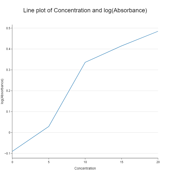
Figure 2: Fractional powers of 10 occurring to small-range data sets. This makes it difficult for analysts and viewers to understand the graph.
Then you should adopt the log base 2 scale, since it is easier to deal with powers of 2. Computer nowadays has made it painless to calculate the values. Some fractional powers of 2 are so close to simple numbers, making them easy to estimate.
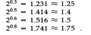
Figure 3: Estimation of fractional powers of 2
Log base e (natural log) for small changes in percentage
Log base e is great for illustrating percentage changes from -25% to 25%. Why? Let’s look at some math. (Don’t panic, it’s real simple.)
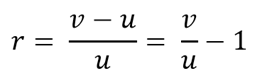
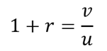
Suppose u and v are two data values. The change of v relative to u, namely r, is calculated as below:
Which means:
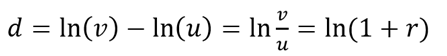
Now let d be the difference of v and u on a natural log scale,
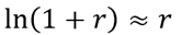
If d is small ( -0.25< d < 0.25),
And therefore,
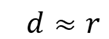
In words: If there is a small difference between two natural log values (d), you can easily estimate the change between two original data points (r), because r is approximately equal to d. So the percentage change (100%r) will be close to 100%d, allowing you to graph with natural log scale without any loss of information. But this estimation is not one-size-fits-all. The larger d is (beyond 0.25), the less accurate it becomes.
Here’s another caveat: it takes a lot of work to go back to the original scale. Apparently e³ is harder to estimate than 2³ or 10³. You may need to show the original scale on another axis for easier comprehension. See an example below:
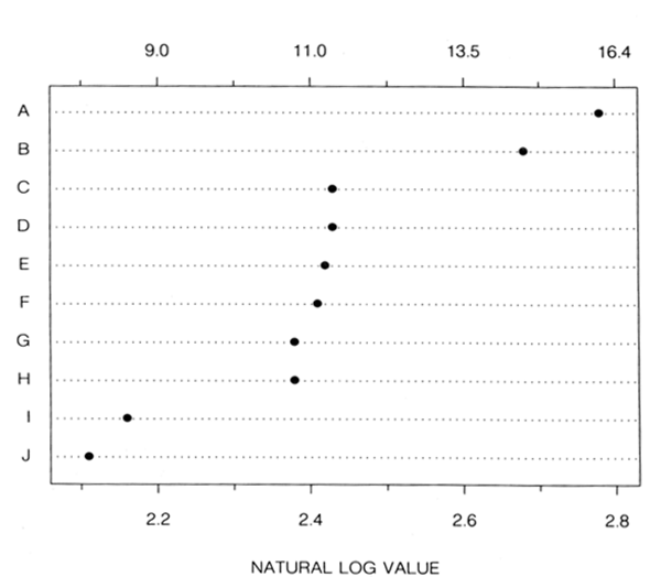
Figure 4: Plotting data with natural logarithms (figure republished from [1]. Copyright 1985 by William. S. Cleveland)
To sum up, the choice of log base depends on the range of your data values.Under proper application, logarithms improve both the analysis and communication of data remarkably well. While log base 10 is excellent for larger ranges, it can hinder the study of small-range data sets, which can be better explained in log base 2 and natural log.
Have we covered everything? Feel free to discuss with us in the comment box below.
The BioTuring Team,
Reference:
[1] William S. Cleveland, The Elements of Graphing Data, Wadsworth Publ. Co. Belmont, CA, USA ©1985, ISBN:0–534–03730–5