Heatmaps. We see them all over the scientific journals — the shading matrices that convey meaningful stories. Wanna interpret gene expressions? Draw a heatmap. Gotta examine the correlation among variables? Get it done with a heatmap. It seems that the shading has breathed such life into those cheerless matrices of plain numbers, making it really easy to compare and spot the differences among groups of interest.
Yet, like anything else, the heatmap color scale can backfire when mistakenly chosen. Either it causes confusion or dizziness, or “heat” of annoyance to your readers. We really do not want to turn a heatmap into a literal “heat” map in this way, do we?
Here’s a couple of dos and don’ts for a heatmap color scale.
Do #1: Use the right kind of color scale
When it comes to heatmaps, the two most common ranges of colors are sequential and diverging scales.
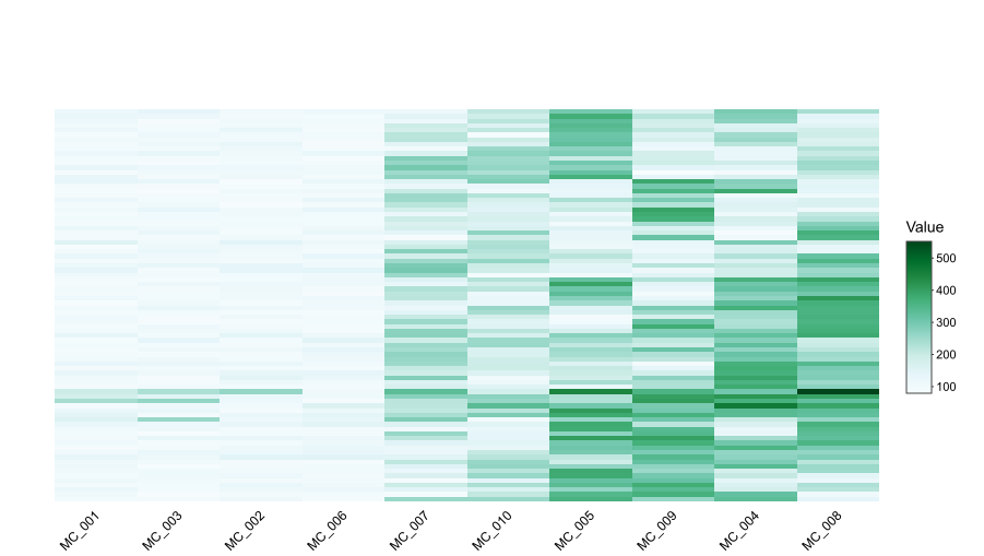
Sequential scales use the blended progression, typically of a single hue, from the least to the most opaque shades, representing low to high values (an example is the ColorBrewer Blues scale). Scales that use multiple hues are also considered sequential when hues progress in a single direction from one end to another (like the Viridis scale).
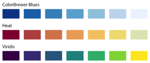
Popular sequential heatmap color scales
Diverging scales, on the other hand, show color progression in two directions: gradually toning down the first hue from one end to a neutral color at the midpoint, then increasing the opacity of the second hue to the other end of the scale.
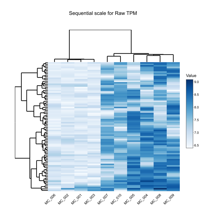
Just go for the sequential scale when you need to differentiate high values from low values. When a reference value is in the middle of the data range (such as zero or an average value), you should use a diverging color scale, with a neutral color representing the reference value. Let’s say you want to build a heatmap of gene expression. A sequential color scale is ideal for showing raw TPM values (all of which are non-negative), while a diverging scale will effectively show standardized TPM values (including those of up-regulated and down-regulated genes).
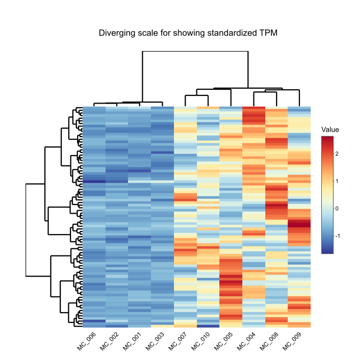
A sequential scale is good for showing raw TPM values. Got a standardized TPM matrix? Go for the diverging scale.
Do #2: Find a color-blind-friendly combination
Five percent of the entire population will thank you! Why limit people from seeing your meaningful visualizations? Color-blind people tend to struggle with the following combos, depending on their conditions: red-green, green-brown, green-blue, blue-gray, blue-purple, green-gray, green-black and light green-yellow. So try to avoid such combos and go for a color-blind-friendly heatmap palette.
Here are a couple of combos that work for a heatmap color scale:
- blue & orange,
- blue & red,
- blue & brown
One more: color-blind people can detect the contrast and opacity, regardless of their impairment. Keep that in mind. There are a lot of options available, right?
Don’t #1: Use the “rainbow” scale
The “rainbow” scale has had its presence on many scientific papers. No doubt that it’s more attractive than a single-hue color scale. But it can be misleading.
One of the problems with the rainbow scale is that people automatically see the brightest color as a peak. Some of your readers might see yellow as the highest value. Another one associates that with orange, or blue. There’s no clear and consistent direction in such a scale.
The rainbow scale also creates the misperception of the magnitude of the data. The values change smoothly, but the colors do not. Abrupt changes between different hues (green to yellow or blue to green) make the values seem significantly distant, while they are actually 0.1–0.2 units far from each other.
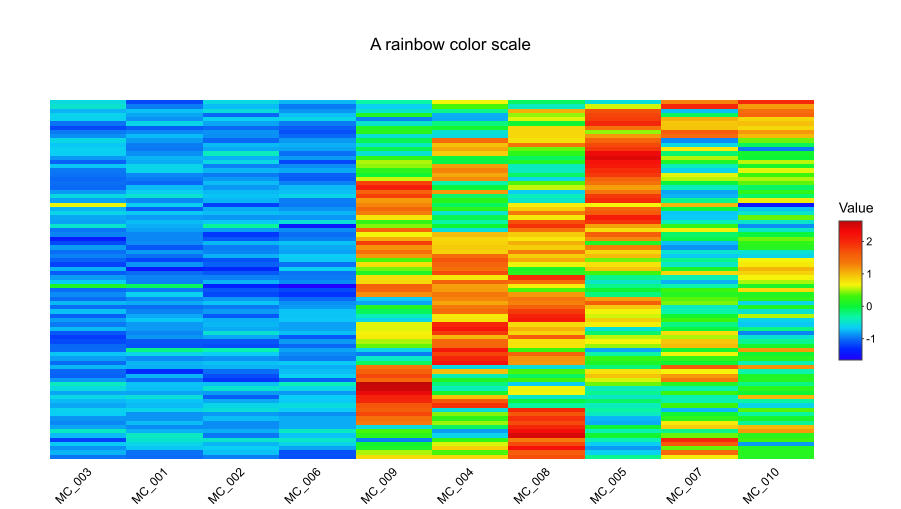
A rainbow color scale is not a good idea for visualizing your data.
Don’t #2: Get greedy with the colors
Don’t put too much color into your heatmap palette. Keep it simple and interpretable. Sequential scales using multiple hues are good to go if the hues closely relate to each other. Otherwise, the heatmap might end up looking exactly like a colorful mosaic that seems attractive at first, but leaves the readers with a dozen of questions. If you once stumble on a green-blue-purple-red scale, you will have to stop and think which two colors are at the extremes. The best option is to pick out 3 consecutive hues on a basic color wheel.
A simple color scale of 2–3 consecutive hues is good to go.
That’s it. The color scale is all-important when it comes to heatmaps, so remember to take good care of it. The utmost goal of a heatmap, or any other kind of visualizations, is to tell stories from the data. Just keep it clear and simple.
You can get BioVinci, a drag-and-drop package for modern data visualizations, to quickly change a heatmap color scale. Here’s a simple tutorial.
Have fun fine-tuning your heatmap!
Pratheek H P
Thanks!