Heatmap Archives - BioTuring's Blog
  • Solutions

      For single-cell sequencing data

    • BioTuring Single Cell Browser
      • What is it?
      • Download
      • Request a quote/demo
      • Document
      • FAQ
    • Hera-T
    • For RNA sequencing data

    • Hera
    • Other solutions

    • BioVinci
    • Bioinformatics partnerships
  • Resources
    • Webinars
    • Blog
    • Videos
  • Forum
    • Profile
    • Setting
    • Log out
  • navigation
    • About us

    • Solutions

        For single-cell sequencing data

      • BioTuring Single Cell Browser
        • What is it?
        • Download
        • Request a quote/demo
        • Document
      • Hera-T
      • For RNA sequencing data

      • Hera
      • Other solutions

      • BioVinci
      • Bioinformatics partnerships
    • Resources

      • Webinars
      • Blog
      • Videos
    • Forum

    • Careers

    • Contact us

    Log in| Sign up
    1. Home
    2. Box plots
    3. Data visualization and analysis
    4. Heatmap
    5. Principal component analysis
    6. Venn diagrams
    7. Violin plots

    BioTuring's Blog

    Data analysis made easy. For biologists, especially.

    6,000,000 cells
    at ease with
    BioTuring Browser
    Explore now

    Category Archives: Heatmap

    Box plots, Data visualization and analysis, Heatmap, Principal component analysis, Venn diagrams, Violin plots
    BioVinci: high-dimensional data visualization made easy for biologists
    by biomembers • April 24, 2020 September 21, 2020

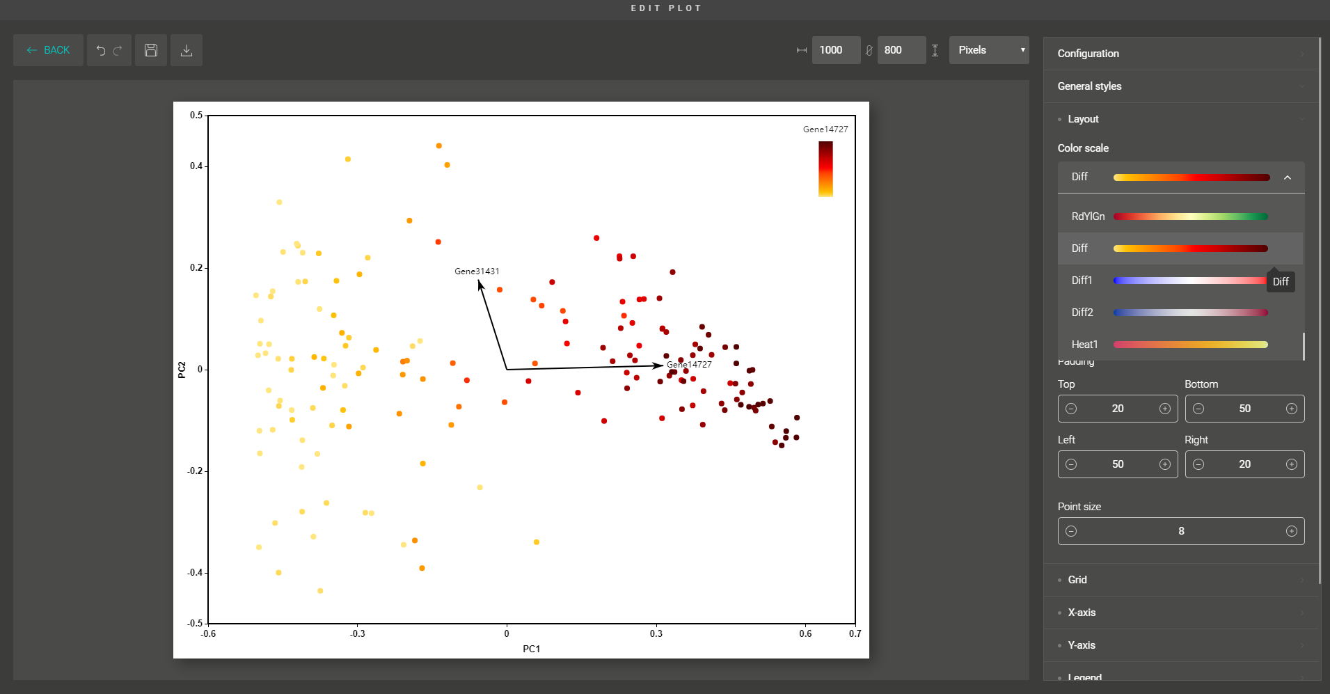
    “How to extract the biology behind this huge matrix of thousands of rows and columns?”  Large numbers of data points hold valuable biological stories yet are tricky to graph and analyze. Imagine you had the data for 1000 features and observations, your mind would be full of questions, wondering how […]

    Data visualization and analysis, Heatmap
    Dos and don’ts for a heatmap color scale
    by biomembers • September 24, 2018 September 21, 2020

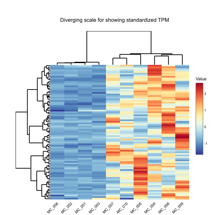
    Heatmaps. We see them all over the scientific journals — the shading matrices that convey meaningful stories. Wanna interpret gene expressions? Draw a heatmap. Gotta examine the correlation among variables? Get it done with a heatmap. It seems that the shading has breathed such life into those cheerless matrices of […]

    Data visualization and analysis, Heatmap
    How to build a hierarchical clustering heatmap with BioVinci?
    by biomembers • May 8, 2018 November 14, 2018

    Heatmap, heatmap everywhere. They are an intuitive way to visualize information from complex data. You see them showing gene expression, phylogenetic distance, metabolomic profiles, and a whole lot more. In this tutorial, we will show you how to perform hierarchical clustering and produce a heatmap with your data using BioVinci. It’s […]

    Recent Posts
    • Explore 10X Visium Spatial Transcriptomics data at ease with BioTuring Browser November 9, 2020
    • A tiny world inside non-small cell lung cancer revealed by single-cell omics: 35 cell types, and their marker genes October 20, 2020
    • The Why, When and How of 3D PCA October 12, 2020
    • 6 best box and whisker plot makers September 18, 2020
    • Immunoglobulin genes up-regulated in lung adenocarcinoma infiltrating T cells: A report from BioTuring lung cancer single cell database September 8, 2020
    Categories
    • BioTuring Cellpedia
    • Data visualization and analysis
      • Box plots
      • Heatmap
      • Principal component analysis
      • Venn diagrams
      • Violin plots
    • RNA-seq data analysis
    • Single Cell Analysis
    • Single-cell RNA-seq tutorials
    • Visium Spatial Transcriptomics Analysis
    Subscribe now
    6,000,000 cells
    at ease with
    BioTuring
    Browser
    Explore now

    We are here to help

    Navigation

    About us
    Contact us
    FAQ
    Blog
    Webinar
    Video
    © 2019 BioTuring. All rights reserved