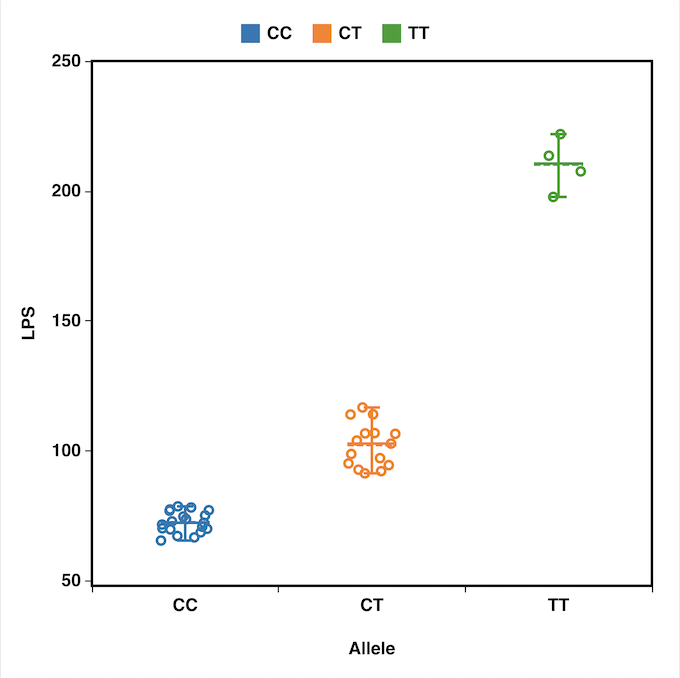
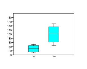
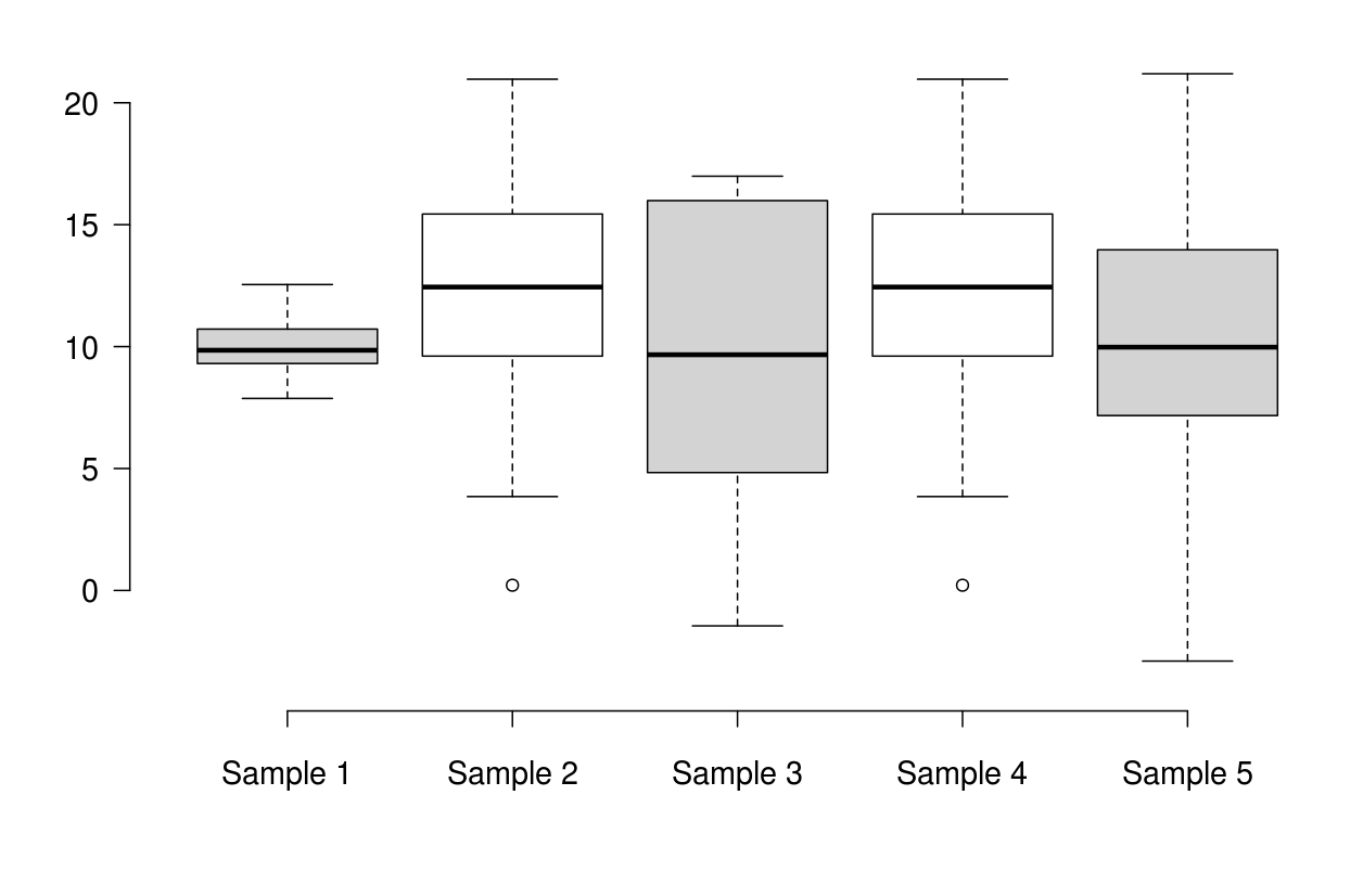
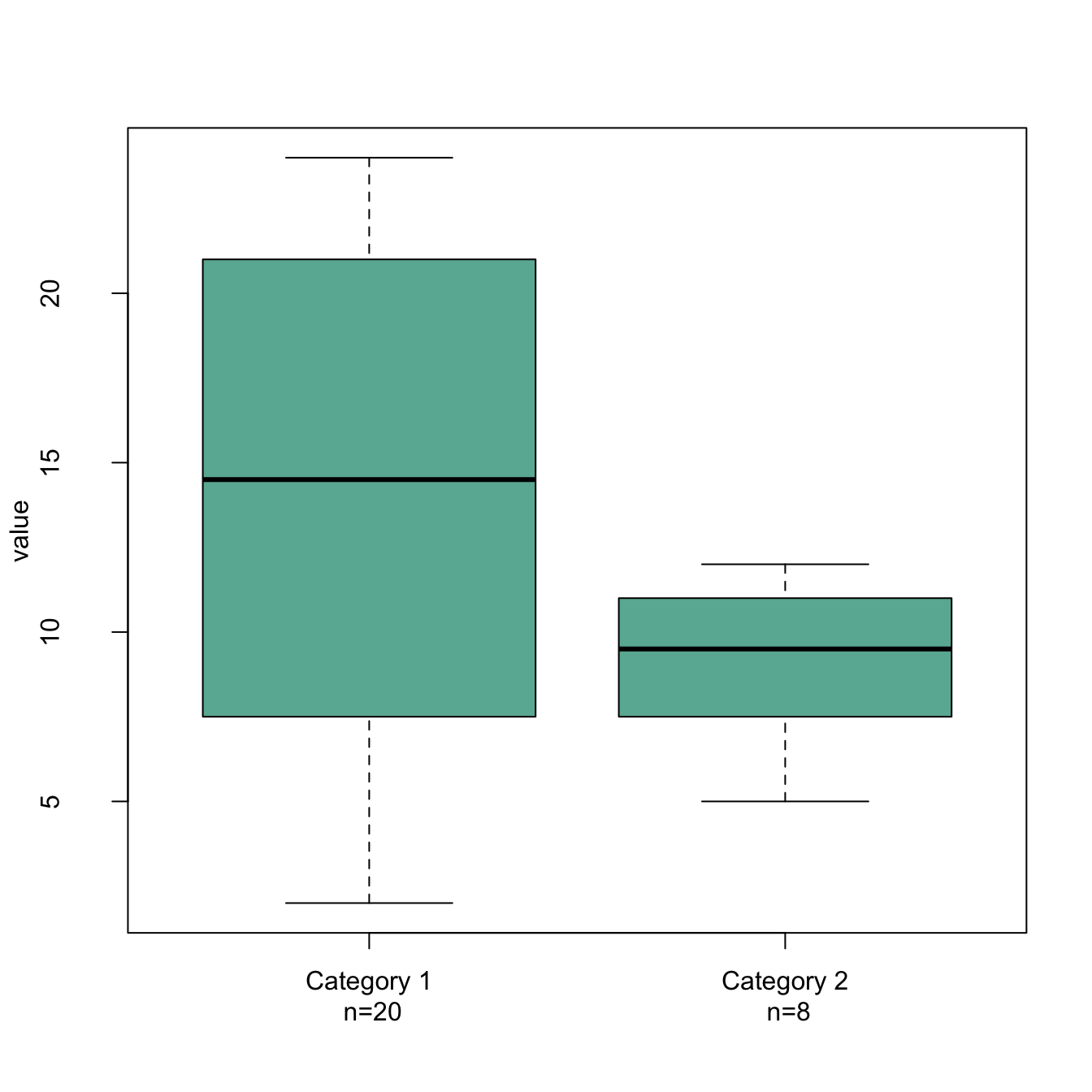
A box and whisker plot, or just box plot, is a graph that visualizes how spread-out a dataset is. A box plot displays 5 values: minimum, first quartile, median, third quartile, and maximum.
How to read a box plot:
The box is drawn from the first quartile to the third quartile. The line inside the box represents the median. The whiskers extend from both ends of the box to the minimum and maximum values. So a box and whisker plot is a type of distribution graph — it shows how the data is dispersed around the median, if the data is skewed, and whether or not it is symmetrical. Box plots take up very little space and therefore are a great option when you want to compare distributions between many groups.
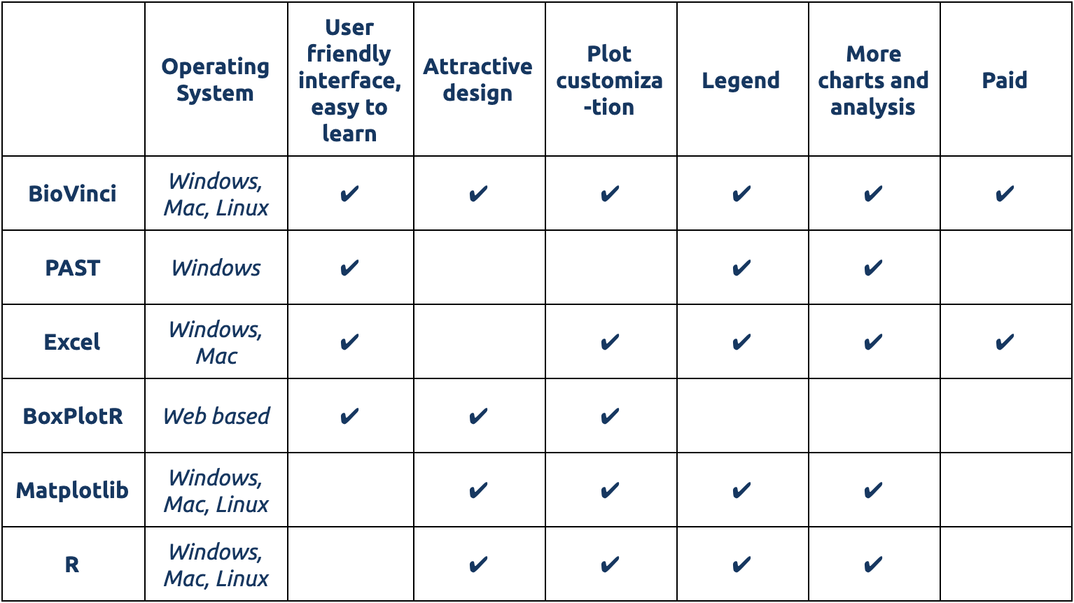
$Here we round up the six best box and whisker plot makers for you to choose from. They range from Python libraries for advanced users to easy drag-and-drop visualization apps that require no learning curve at all. These box and whisker plot makers can handle large datasets, and most of them are free or come with a free trial period.
A summary of the 6 best box and whisker plot makers:
User-friendly box and whisker plot makers
1.BioVinci
BioVinci is a terrific software for data visualization and analysis. Making box plots with BioVinci is a cinch: import your data, drag and drop columns you want to plot, and you’re done. BioVinci is perhaps the only tool that does not require you to format your data in any particular way. The software also comes with a full suite of options to customize your box and whisker plots. Here’s a step-by-step guide on how to make box plots with BioVinci, though you probably won’t need it — BioVinci is really intuitive.

BioVinci is a rare option that offers a friendly interface without sacrificing power. Other than boxplots, the software is also capable of creating highly attractive graphs and running various analyses for data exploration such as PCA, feature selection, and heatmaps. While it requires a paid license, BioVinci offers a 15-day free trial for new users. Try BioVinci’s box and whisker plot maker here.
Pros: produces highly attractive plots, customizable, very user friendly.
Cons: paid option (15 day free trial available).
2. PAST
PAST is an open source statistical analysis software for Windows. PAST allows you to create a dozen types of graphs, including box plots, and it also lets you run various statistical tests.
You can import data into PAST in XLS, TXT, or DAT formats. Creating box plots in PAST is pretty straightforward: select data to plot, go to Plot menu, and select Barchart/Boxplots. PAST gives you a few options to customize your box plots, most notably the option to enable or disable outliers.
Pros: open source (free), comes with various options for plotting and performing statistical analysis.
Cons: Only works on Windows; data files need to be formatted correctly to be plottable.
3. Excel
If you like using Excel and have the 2016 or later versions, we have good news: you can make box and whisker plots in Excel. Unlike earlier versions where you have to do a lot of tweaking to modify column charts into box plots, Excel 2016 and later versions actually come with a chart template for box plot.
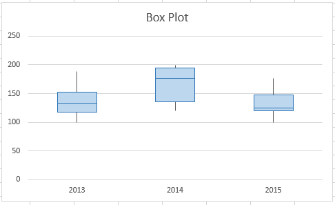
Here is how to make a box and whisker plot in Excel: First, select the data to plot. Then go to the Insert tab, locate the Chart group, and select the Statistical Chart symbol. Click the Box and Whisker chart button. Once the box plot is made, you can add a chart title and legend, and customize the plot appearance.
Pros: easy to use if you are already familiar with Excel.
Cons: limited options to customize plots; only works in Excel 2016 or later.
4. BoxPlotR
If you want to use R to make box plots but don’t have time to figure out the syntax, BoxPlotR is an excellent solution. BoxPlotR is a web-based application that was written in R, so it has most (if not all) of the customizing options from R, but those options are presented in a very friendly interface (as in: fill in the blanks and you’re done).
Note that BoxPlotR requires your data file to be formatted in a specific arrangement, that is, identical to their sample dataset, in order to be plotted. There is no option to add legends, so you’ll have to patch those in after downloading the plots. And as the name indicates, BoxPlotR makes box plots and box plots only. If you want a tool that offers a variety of data visualization options, you might have to look elsewhere. Nonetheless, BoxPlotR is still one of the best box and whisker plot makers out there.
Pros: customizable; user-friendly; open source.
Cons: requires specific data format; only makes box plots.
Command line box and whisker plot makers
5. Matplotlib
Matplotlib is a Python library — a collection of reusable code — for plotting. Matplotlib is very useful in creating attractive and customizable graphs and plots, as long as you are comfortable with Python.

Matplotlib is a command-line tool and therefore comes with a steep learning curve. You might find it easier to learn if you are already familiar with Matlab, since the Matplotlib interface is similar. Here’s a simple tutorial on how to make box plots with Matplotlib.
Pros: Creates highly attractive and customizable box plots; open source.
Cons: Steep learning curve, only works with Python.
6. R
R is very popular among researchers who frequently deal with large datasets. Like Matplotlib, its command-line interface is not the most friendly for users who are not familiar with the language. While you might have to spend a considerable amount of time and effort to learn how to plot in R, it does provide an excellent tool for visualizing large datasets.
You can create box and whisker plots in R using the boxplot() function. Here’s a good tutorial on how to make box plots in R.
Pros: creates customizable box plots; open source; excellent at handling large datasets.
Cons: steep learning curve.
We hope that the post helps you find the right tool to create your box plots.
Please leave a comment if you have any questions and share the topic you want us to write in the comment.