Box plots, a.k.a box-and-whisker plots, are an excellent way to compare groups. They are intuitive: viewers can see samples’ medians, distribution, and variabilities with a quick glance. They allow comparing samples of different sizes; for example, a set of 50 data points with a set of 30. They don’t even assume a normal distribution and therefore are non-parametric. So they are pretty much magic. Here’s how to make this magic happen with BioVinci.
Step 1: Import data
Open BioVinci -> Create new workset -> Drag and Drop file here. Choose the file you want to diagram. BioVinci supports TSV, CSV and Excels files.
Once the file is uploaded, you will be prompted to name the workset. After that, click the Box plot icon at the bottom of the screen.
There is a Source list on the left that shows the data table and its columns that you’ve just imported. You can edit the source table by clicking Edit data(top left).
Step 2: Draw box-and-whisker plot, with and without outliers
Drag the columns you want to diagram from the Source list to the X and Yplaceholders. Depending on how you arrange data in your source table, there are two ways to do this:
- If each column in the table is a group: drag and drop all columns to the Yplaceholder.
- If one column contains group names, and the other has values: drag the group name column to X, and the value column to Y.
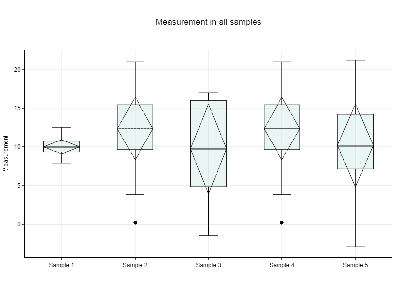
BioVinci is a box plot maker with outliers. You have the option to show outliers as dots outside of the whiskers, making a modified box plot. To do this: right click on the plot, choose Points -> Outliers.
Note that by default, the whiskers extend from the minimum to the maximum values. BioVinci identify data points as outliers when they fall outside the upper and lower fences.
Step 3: Customize box-and-whisker plot
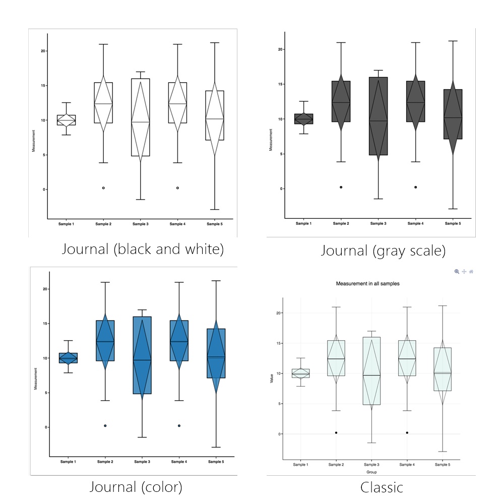
The easiest way to make your plot publication-ready is to choose from one of the preset Themes and Sizes at the bottom of the screen. Available themes are journal black and white, journal gray scale, journal color, and classic. Check your journal for their specific requirements.
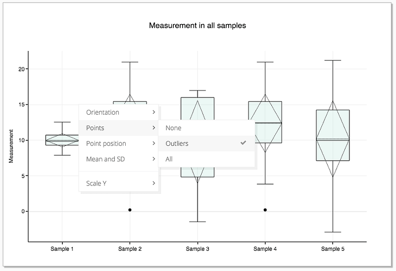
Want to DIY? Right click on the plot and you will have the options to:
- Change the Orientation of the plot,
- Show data Points (BioVinci can make modified box plots that show outliers),
- Choose where to show data Point position,
- Show Mean and SD,
- Plot with log Scale.
For more options, click Edit plot at top of screen. This will let you customize colors, patterns, grids, and other features of the graph. You can also add text (title, legend, and labels) to the plot. Need help with this? Check out our blog posts on Good chart, bad chart and How to write a figure legend for scientific papers.
Step 4: Save and Export.
Your box-and-whisker plot is ready. Don’t forget to Save plot and Export — the buttons are at top of screen.
More questions? Leave a comment, we’ll get back to you right away.