Principal component analysis (PCA) is one of the most popular dimension reduction methods. It works by converting the information in a complex dataset into principal components (PC), a few of which can describe most of the variation in the original dataset. The data can then be plotted with just the two or three most descriptive PCs, producing a 2D or 3D scatter plot. This PCA plot makes it possible to visualize strong patterns, such as groups of similar observations, in the original dataset.
Read more: Principal component analysis explained simply.
In this post, we will focus on 3D PCA: what it is, when to use it, and how to run 3D PCA using BioVinci.
What is 3D PCA?
Most of the time, a PCA plot is a 2D scatter plot in which the data is plotted with two most descriptive principal components. However, you can choose to plot with three PCs instead, and this will create a 3D scatter plot, also called 3D PCA.
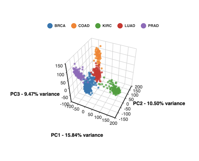
3D PCA created with BioVinci
When should I use 3D PCA?
The key difference between 2D PCA and 3D PCA is the number of principal components being selected for plotting. In PCA, principal components are constructed to capture the most variation in the dataset: PC1 describes the most variation, PC2 describes the second most variation, and so forth. As a result, the first two or three PCs can capture most of the variation and the rest can be discarded without losing much information. This can be seen in a scree plot.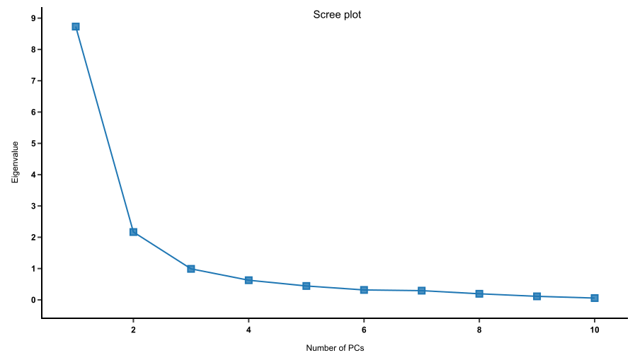
A scree plot shows how much variation each PC captures from the data. The y axis represents eigenvalues, i.e. the amount of variation. The x axis represents numbers of principal components.
Read more: How to read PCA biplots and scree plot
1. Cattell’s scree test: select PCs before the “elbow” in the scree plot
A scree plot provides a good indication whether or not you should select three principal components to plot, thus creating a 3D PCA. A good scree curve usually has a bend (“elbow”) that can be used as the cutoff point for PC selection. The PCs before the “elbow” are significant and should be kept; while the PCs after the bend could be discarded without losing much information.
If the scree plot bends after the first two PCs, those two should be kept for plotting and a 2D PCA is sufficient to describe the data. If the bend occurs after three PCs instead, that is a call for 3D PCA.


Cattell’s scree test helps determine the number of PCs to be selected. Scree curve 1 bends at 2 PCs. Scree plot 2 has an “elbow” at 3 PCs, indicating that 3 PCs should be selected to plot a 3D PCA. Scree plots created with BioVinci.
2. Kaiser’s rule: select PCs that have eigenvalues of at least 1
Another rule for picking PCs is Kaiser’s rule, which states that the selected PCs should have eigenvalues of at least 1. A lower eigenvalue indicates that the PC contains less information than a single variable and therefore could be discarded.
Read more: Comparison of Five Rules of Determining the Number of Components to Retain
3. Proportion of variance: select PCs that describe most of the variance
Keep in mind that PCA helps reduce the overwhelming number of dimensions while still capturing the essence of the data. The proportion of variance plot shows how much variation is captured by each PC. What percentage of variance is considered “essential”? That is entirely up to you. The general recommendation is to select the PCs that can describe at least 70 to 80 percent of the variance. For example, if the first two PCs add up to 60% of variance, but including PC3 brings it up to 75%, then you might want to consider 3D PCA to avoid losing information.

Scree plots created with BioVinci.
4. Visualization: select PCs that best visualize patterns of the original dataset
Though PCA is not a clustering method, by reducing dimensionality, it can help visualize patterns, such as groups of similar expression profiles. These patterns might not be visible on a 2D PCA plot, but show up more clearly in 3D. In that case, 3D PCA could be what you need.
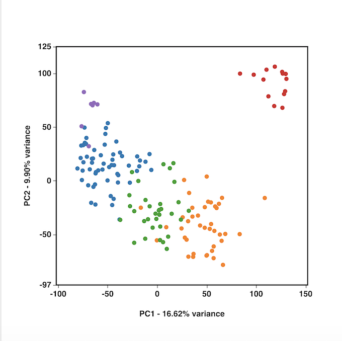
2D and 3D PCA created by BioVinci, in which 3D PCA show clearer clustering.
How to run 3D PCA with BioVinci
If you know some coding, there are packages to create 3D PCA plot in R, Python. 3D Scatter Plot in Matplotlib can also plot 3D PCA.
If you are looking for a quick and easy option to run 3D PCA, try BioVinci. Our software packs powerful tools for data visualization and analysis with a very user-friendly interface.
Follow these 4 easy steps to run 3D PCA with BioVinci:
- Step 1. Import your data: Click Add New Workset and upload your data in our supported format ( .tsv, .csv, .xlsx, .feather)
- Step 2. Select the Dimensionality reduction tab. Under Method, select Principal component analysis.
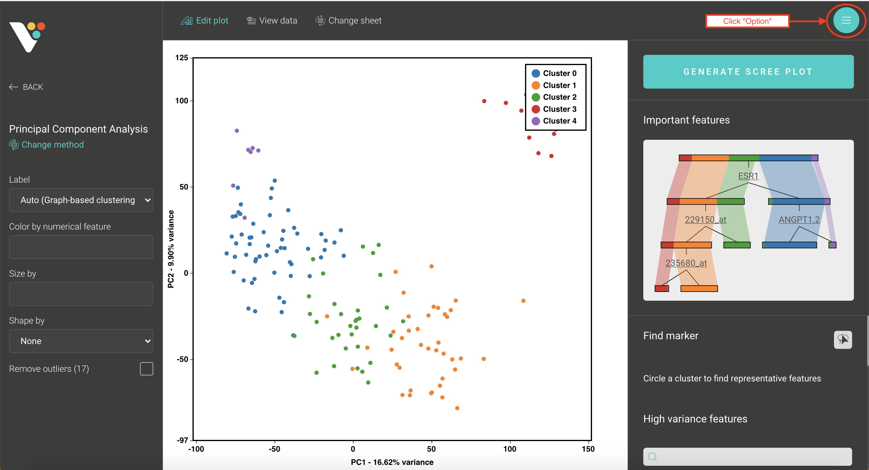
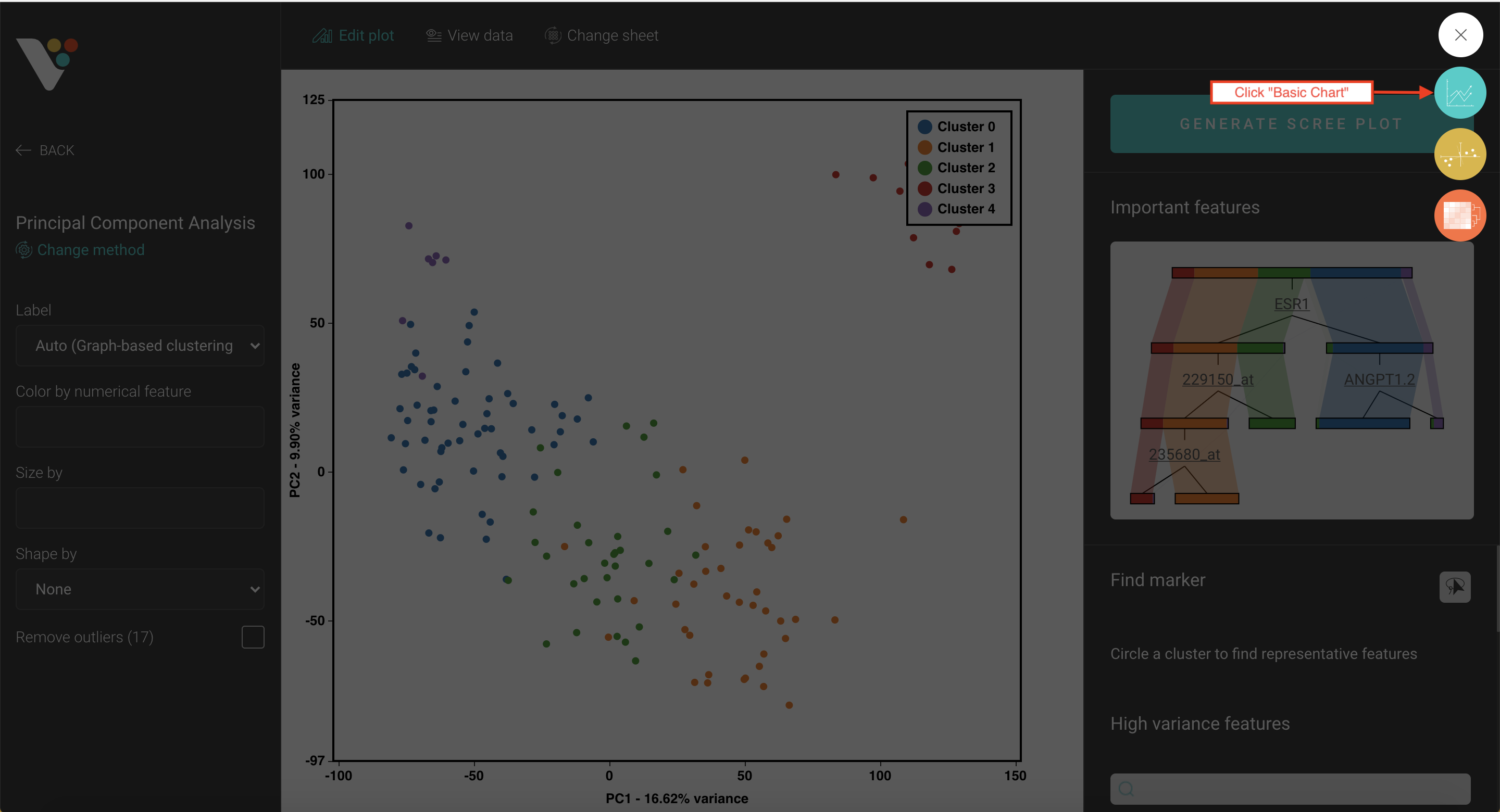
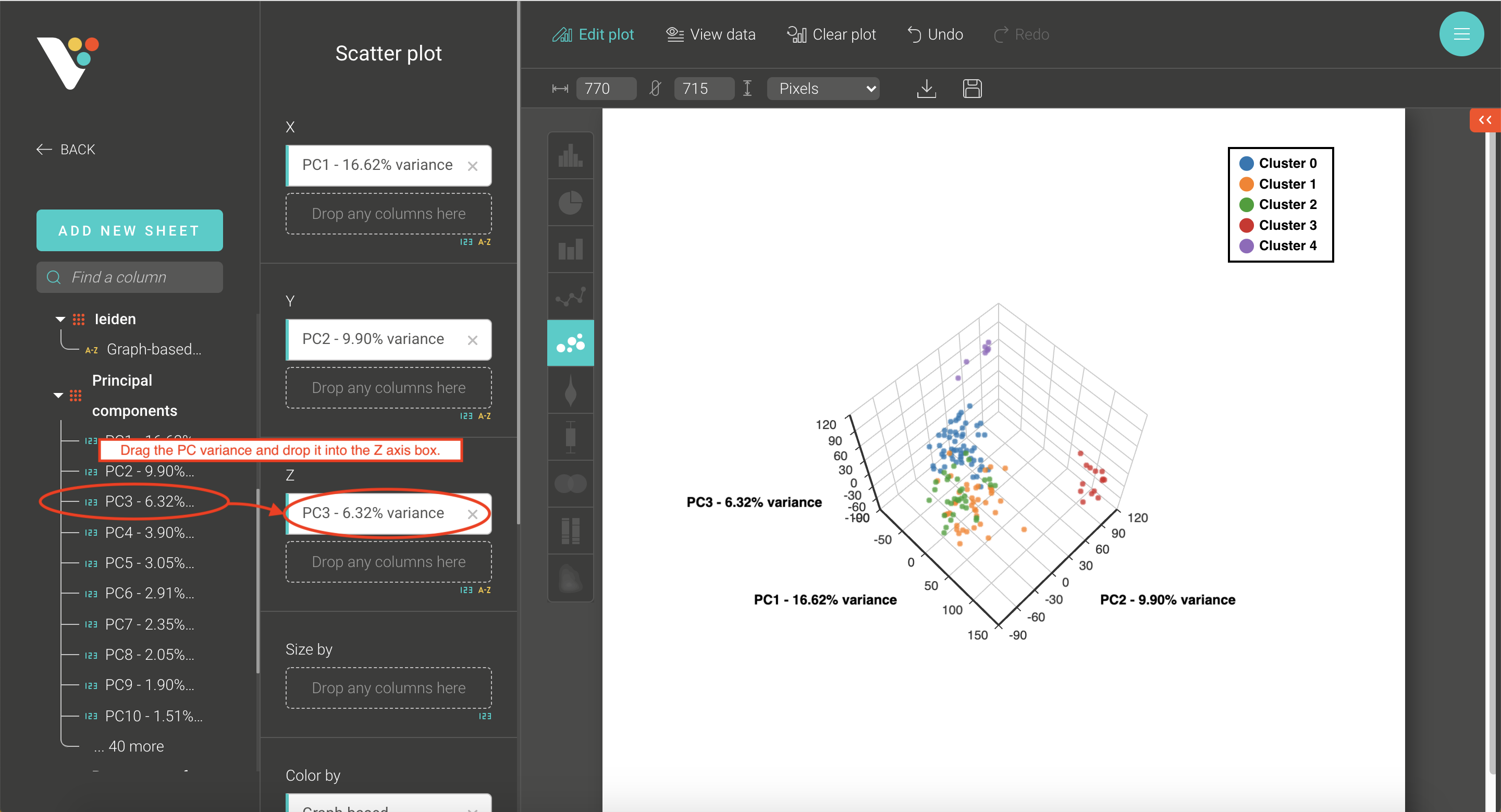
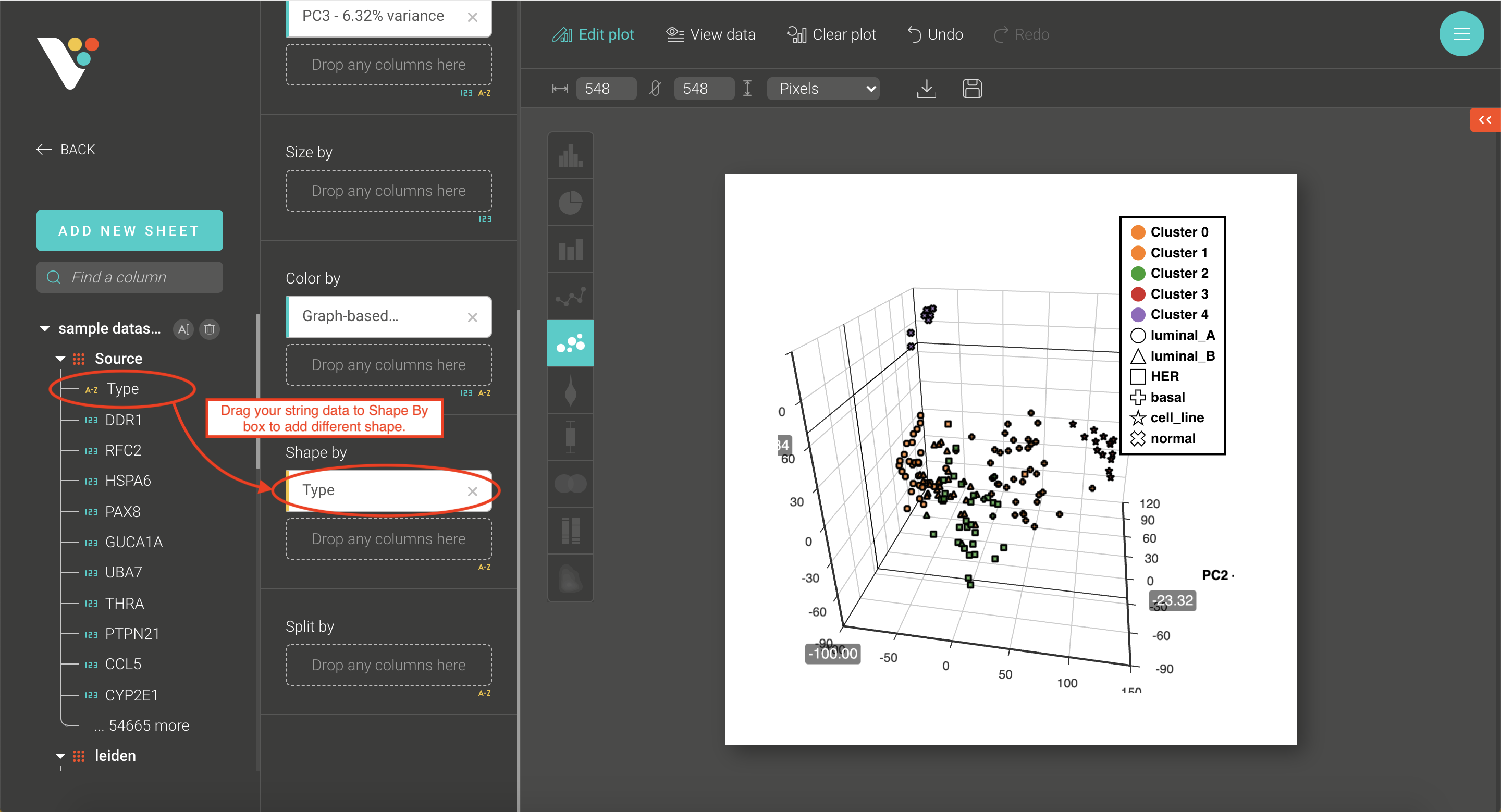
- Step 3. BioVinci will automatically run a 2D PCA. To change to 3D PCA, click the Option button on the top right corner, then select Basic chart. Drag the PC3 column and drop it into the Z axis box. Drag your grouping data to the Shape by box to have different shapes for your grouping.
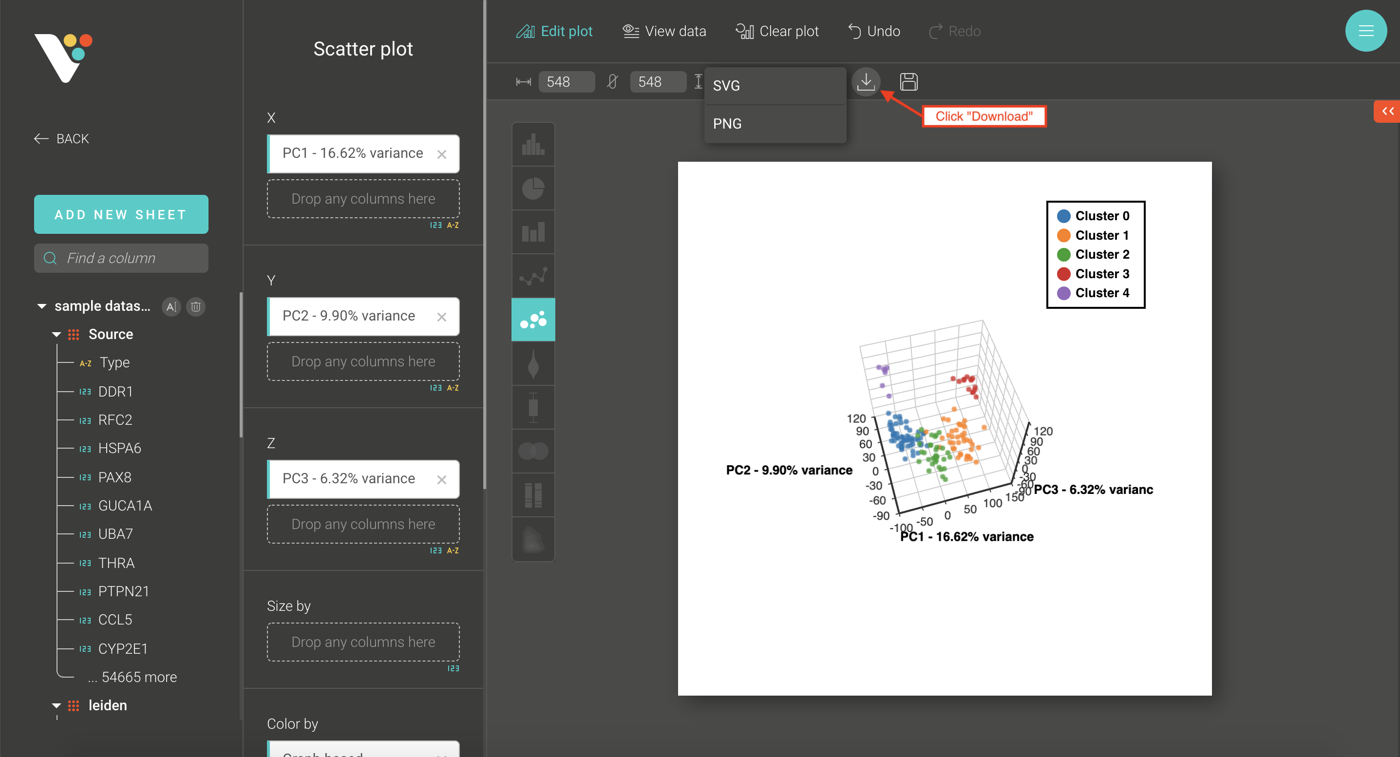
- Step 4. Click the Download button to save your plot as .sgv or .png.
Step 1: Import your data: Click Add New Workset and upload your data in our supported format ( .tsv, .csv, .xlsx, .feather)

Step 2: Select the Dimensionality reduction tab. Under Method, select Principal component analysis.


Step 3: BioVinci will automatically run a 2D PCA. To change to 3D PCA, click the Option button on the top right corner, then select Basic chart.
Step 4: Click the Download button to save your plot as .sgv or .png.
Make your own 3D PCA plot with BioVinci and share with us the result. There is always room to improve so please also share with us how to make this feature even better for you!
Like our post? Share it with your friends: