Linh Ngo, Author at BioTuring's Blog
  • Solutions

      For single-cell sequencing data

    • BioTuring Single Cell Browser
      • What is it?
      • Download
      • Request a quote/demo
      • Document
      • FAQ
    • Hera-T
    • For RNA sequencing data

    • Hera
    • Other solutions

    • BioVinci
    • Bioinformatics partnerships
  • Resources
    • Webinars
    • Blog
    • Videos
  • Forum
    • Profile
    • Setting
    • Log out
  • navigation
    • About us

    • Solutions

        For single-cell sequencing data

      • BioTuring Single Cell Browser
        • What is it?
        • Download
        • Request a quote/demo
        • Document
      • Hera-T
      • For RNA sequencing data

      • Hera
      • Other solutions

      • BioVinci
      • Bioinformatics partnerships
    • Resources

      • Webinars
      • Blog
      • Videos
    • Forum

    • Careers

    • Contact us

    Log in| Sign up
    1. Home

    BioTuring's Blog

    Data analysis made easy. For biologists, especially.

    6,000,000 cells
    at ease with
    BioTuring Browser
    Explore now

    Author Archives: Linh Ngo

    Data visualization and analysis, Principal component analysis, RNA-seq data analysis
    How to read PCA biplots and scree plots
    by Linh Ngo • June 18, 2018 September 21, 2020

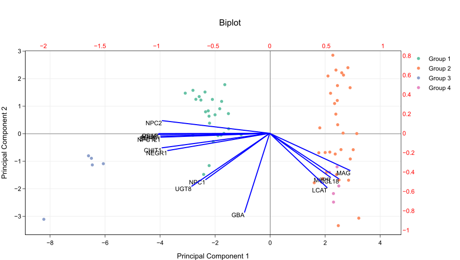
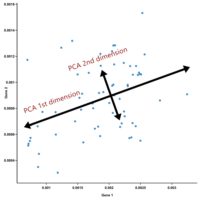
    Principal component analysis (PCA) has been gaining popularity as a tool to bring out strong patterns from complex biological datasets. We have answered the question “What is a PCA?” in this jargon-free blog post — check it out for a simple explanation of how PCA works. In a nutshell, PCA capture […]

    Data visualization and analysis, Principal component analysis, RNA-seq data analysis, Single Cell Analysis
    Principal component analysis explained simply
    by Linh Ngo • June 14, 2018 December 5, 2018

    As we are entering the era of Big Data, everyone and their moms seem to be talking about PCA. All the papers you read mention PCA (with lots of jargon, of course). Half of the seminars you’ve been to this month touch on PCA. Your boss/collaborators suggest trying PCA on your data. “What […]

    Box plots, Data visualization and analysis
    More on how to compare box plots
    by Linh Ngo • May 22, 2018 December 5, 2018

    We showed a quick and easy way to compare box plots in previous post. Let’s dig deeper into what information you can use to compare two box plots. Overlapping boxes and medians It gets tricky when the boxes overlap and their median lines are inside the overlap range. As always, math comes to […]

    Box plots, Data visualization and analysis
    How to compare box plots
    by Linh Ngo • May 22, 2018 September 27, 2020

    Box plots, a.k.a. box-and-whiskers plots, are an excellent way to visualize differences among groups. They manage to carry a lot of statistical details — medians, ranges, outliers — without looking intimidating. But box plots are not always intuitive to read. How do you compare two box plots? The key information […]

    Data visualization and analysis, Violin plots
    5 reasons you should use a violin graph
    by Linh Ngo • May 16, 2018 December 5, 2018

    1. Violin graph is like box plot, but better Box-and-whisker plots are great. They show medians, ranges and variabilities effectively. They allow comparing groups of different sizes. They are super simple to create and read, so naturally, they are all over the place. But box plots can be misleading. They are not […]

    Box plots, Data visualization and analysis
    How to draw a modified box plot
    by Linh Ngo • May 13, 2018 December 5, 2018

    Box plots, a.k.a box-and-whisker plots, are an excellent way to compare groups. They are intuitive: viewers can see samples’ medians, distribution, and variabilities with a quick glance. They allow comparing samples of different sizes; for example, a set of 50 data points with a set of 30. They don’t even […]

    Box plots, Data visualization and analysis, Violin plots
    How to craft a figure legend for scientific papers
    by Linh Ngo • May 10, 2018 October 29, 2020

    Writing a scientific paper? Preparing for publication? Making a poster for a conference tomorrow? Let’s face it: People will skim through the body text of your paper/poster, and only look at the figures. We all love figures. They catch eyes, they deliver information effectively, they highlight your results. Figures are […]

    Recent Posts
    • Explore 10X Visium Spatial Transcriptomics data at ease with BioTuring Browser November 9, 2020
    • A tiny world inside non-small cell lung cancer revealed by single-cell omics: 35 cell types, and their marker genes October 20, 2020
    • The Why, When and How of 3D PCA October 12, 2020
    • 6 best box and whisker plot makers September 18, 2020
    • Immunoglobulin genes up-regulated in lung adenocarcinoma infiltrating T cells: A report from BioTuring lung cancer single cell database September 8, 2020
    Categories
    • BioTuring Cellpedia
    • Data visualization and analysis
      • Box plots
      • Heatmap
      • Principal component analysis
      • Venn diagrams
      • Violin plots
    • RNA-seq data analysis
    • Single Cell Analysis
    • Single-cell RNA-seq tutorials
    • Visium Spatial Transcriptomics Analysis
    Subscribe now
    6,000,000 cells
    at ease with
    BioTuring
    Browser
    Explore now

    We are here to help

    Navigation

    About us
    Contact us
    FAQ
    Blog
    Webinar
    Video
    © 2019 BioTuring. All rights reserved