How to Make Sense of Single-cell RNA Sequencing Data? Less is More
Thanks to single-cell RNA sequencing (scRNA-seq), researchers are blessed with a trove of information. Yet, this blessing is also a curse in data visualization and further analysis! Since each cell is described by its gene expression profile, our final dataset will have hundreds to thousands of dimensions. Such a high dimensional graph hardly tells us anything since the cells are so sparse and disconnected.
That’s when dimensionality reduction comes to the rescue. The process not only makes scRNA-seq datasets easier to work with, it also removes redundancies and brings out the most relevant information.
In this category, Principal component analysis (PCA) is a well-known name. While this method is great with clustering, its linear nature is not so great for visualizing the highly non-linear scRNA-seq data.
- Need more information? Here’s all you need to know: PCA explained simply, how to read PCA plots, and the gist of 3D PCA
For the purpose of data visualization, non-linear, graph-based methods are the way to go. If you search for it, your most likely options will be t–Stochastic Neighbourhood Embedding (Van der Maaten and Hinton, 2008) or t-SNE for short, and Uniform Manifold Approximation and Projection (McInnes et al., 2018) or UMAP for short. The former has been the gold standard in scRNA-seq data analysis pipeline for years, while the latter is a rising star.
The cloud of confusion between UMAP vs t-SNE has been going for a while. t-SNE and UMAP seem similar in their principles, but the outcomes are (sometimes) dramatically different. Users’ confusion often revolve around following questions:
- UMAP vs t-SNE, which is better?
- What is the difference between UMAP vs t-SNE?
- What advantages does UMAP offer over t-SNE?
- What pitfalls should we consider when interpreting UMAP or t-SNE plot for single-cell RNA-Seq?
In this article, we’ll give you the answers in the simplest manner possible. We’ll also demonstrate their differences and the consequential effects on your data, using examples from BBrowser.
1. Weighing UMAP vs t-SNE
1.1. UMAP vs t-SNE, which is better?
The short answer is: none! Both do wonders to scRNA-seq data visualization. They stem from basically the same idea: build a graph that represents data in high dimensional space, then try to reconstruct the graph in a lower dimensional space, as similarly as possible.
They undergo similar steps: (1) calculate the “distance” between a cell and a controlled number of neighbors in the high dimensional space, (2) make sure that these “distances” are similar when data is moved to a lower dimensional space.
Several comparisons have shown that with a deep understanding and careful optimization in key parameters, their final outcomes are similar in most cases (Betch et al., 2019, Xiang et al., 2021, Kobak et al, 2019). An example from a dataset from Ma et al., 2019, done by BBrowser, agrees with this statement (Figure 1).
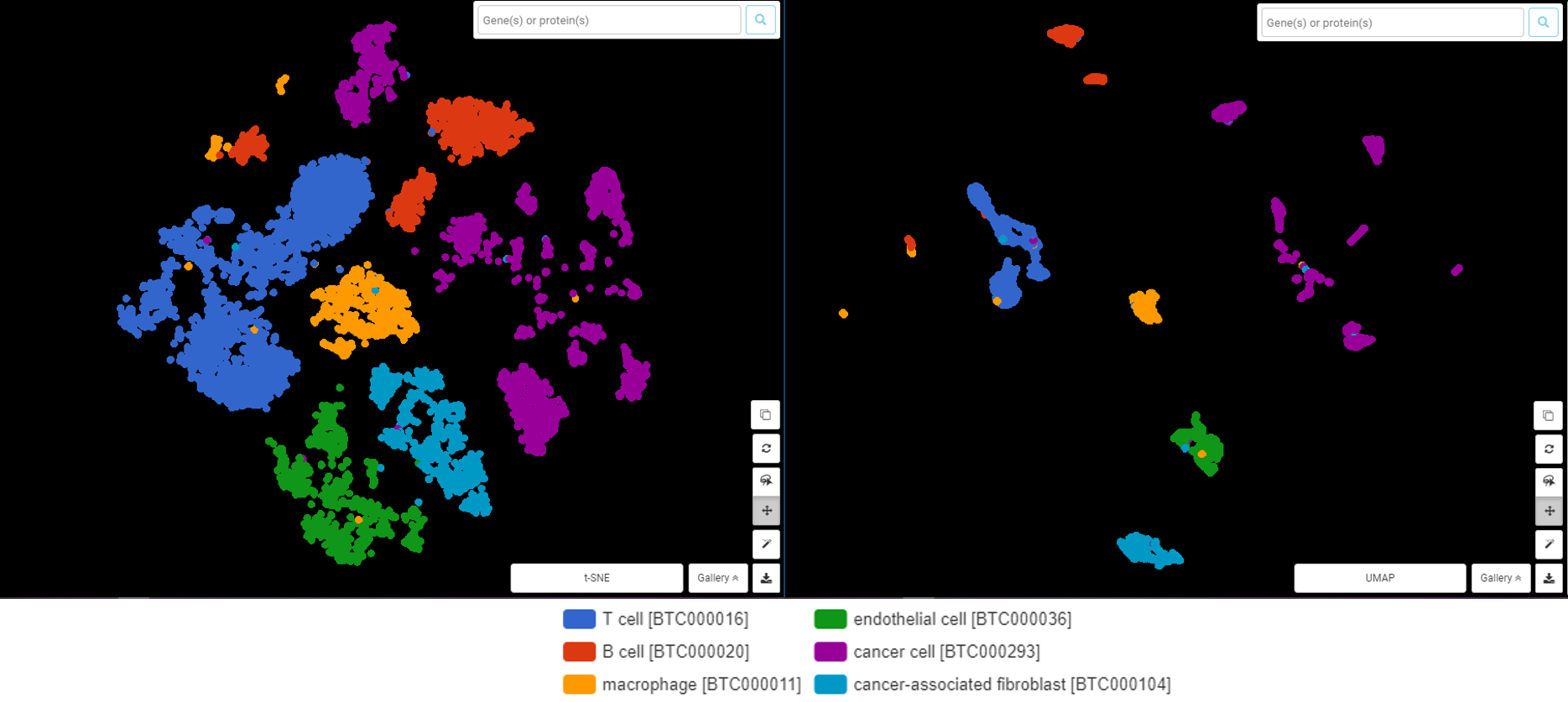
Figure 1. t-SNE (left) and UMAP (right) visualize the scRNA-Seq data from Ma et al., 2019 in liver cancer cells, done by BBrowser. Both did a good (and similar) job on clustering different cell types
1.2. What is the mathematical difference between UMAP vs t-SNE?
So does that mean we can pick whichever we like? Not so fast. Each method uses a different approach to solve the said workflow. At the core of the difference is how t-SNE and UMAP define the said “distance” while building the high dimensional graph:
- t-SNE uses a Gaussian probability function to calculate how likely a cell will pick another cell as its neighbor, and repeats this step for all cells. In the low dimension space, cells are rearranged according to these distances, creating the t-SNE plot.
- UMAP, in a more clever way, creates a fuzzy graph that accurately reflects the topology (a.k.a shape) of the true high dimensional graph, calculates the weight for edges of this graph, then builds the low dimensional graph mimicking the fuzzy graph. The foundation for such an idea is the Nerve theorem, which tells us that a subset of points can accurately reflect the topology of a graph given a set of conditions.
In another word: while t-SNE moves the graph point-to-point from high to low dimensional space, UMAP makes a fuzzy, but topologically similar graph and compresses it into a lower dimension.
Would you like to know more about the detailed calculation in each step? Let us know in the comment!
Either way, they face the same problem: the “distance” must be constrained, otherwise cells will be all connected or isolated. This is the Curse of Dimensionality where data points are so sparse. The constraint is put on the number of neighbors that a cell can pick.
Due to the mathematical difference, each method has different parameters to control this. For t-SNE, it’s the perplexity. For UMAP, it’s the number of neighbors (n_neighbor). The two parameters are what we should take care of when optimizing our data visualization.
Being born a decade later, UMAP of course brings some more convenient features to the table. Here are the list of advantages that UMAP offers, keep in mind that it doesn’t necessarily throw t-SNE out of the window. Combining t-SNE and UMAP allows you to see your data in more angles.
2. UMAP’s offers: Time and Computer Resource, Global Structure and Trajectory Analysis
2.1. Time and Computation Cost
Thanks to the solution in building the high dimensional graph, UMAP theoretically saves more time and computation cost than t-SNE. It is reported that dimensionality reduction of a dataset from 784-D to 3-D took UMAP only 3 minutes, while it took t-SNE 45!
In our experience with datasets in the BioTuring public single-cell database, the difference is not that striking for datasets with small to moderate size. For example, with the dataset from Hu et al. (2019) containing 2,467 cells, the computing time for t-SNE and UMAP are roughly the same: less than 2 minutes. The same goes for the dataset from Song et al. (2019) containing 11,485 cells.
But when you deal with a huge dataset, UMAP will show its strength. With the dataset of Maynard et al (2021), containing almost 50,000 cells, t-SNE took us at least 30 minutes and causes a burden on an average computer, while UMAP is done in 2-3 minutes on the same computer.
2.2. Global Structure and Trajectory Analysis
Again, building the high dimensional graph differently helps UMAP balance local and global structure better. Look at the example below from the dataset of Hu et al. (2019) in human fetal neural retina and retinal pigment epithelium (Figure 2). In terms of local structure (distances between cells within a cluster and the overall shape of clusters), t-SNE plot and UMAP are quite similar (e.g Retinal pigment epithelium, represented in red).
However, the global structure shows a clear difference, especially in the relationship between Retinal progenitor cells (green) and Retinal ganglion cells (blue). With t-SNE, the distance from Retinal progenitor cells to every other cluster is quite the same, even though we can see that retinal progenitor cells are slightly closer to cell types that they give rise to (retinal ganglion cells, horizontal cells, amacrine cells, bipolar cells, rod and cone photoreceptor cells, and Müller glia cells). This is one of the common pitfalls that people encounter when reading t-SNE plot, that is, drawing conclusions from t-SNE’s representation of the global structure.
Meanwhile, UMAP gives a nice insight: within Retinal progenitor cells, there can be two subpopulations, one is closely connected to Retinal ganglion cells, the other is clustered with Muller glial cells (light red), Horizontal cells (yellow). In addition, UMAP also draws a clearer separation between Retinal pigment epithelium cells, Fibroblast, and Microglial from the other cell types arise from Retinal progenitor cells
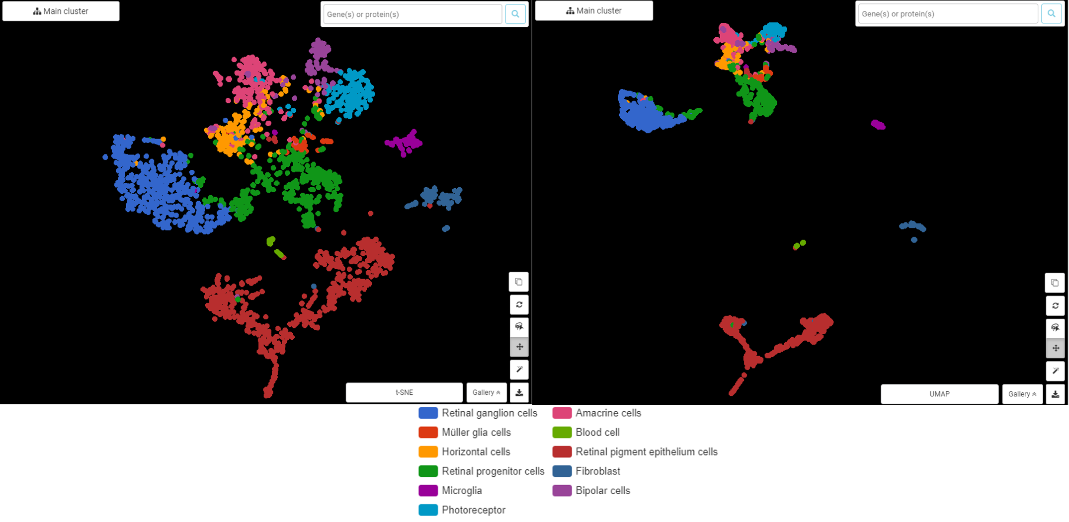
Figure 2. t-SNE (left) and UMAP (right) plot the cell types in human fetal neural retina and retinal pigment epithelium, showing differences in global structure, done by BBrowser
This insight is beneficial for generating hypothesis in Trajectory Analysis (Figure 3). As the figures below demonstrated, UMAP-based trajectory analysis suggests two pathways: (1) from retinal progenitor cells -> retinal ganglion cells, and (2) from retinal progenitor cells ->horizontal cells -> Amacrine cells -> photoreceptor cells -> Muller glial -> bipolar cells. This branching closely captured the temporal order of cell types that arose along the generation of human retina (Figure 4).
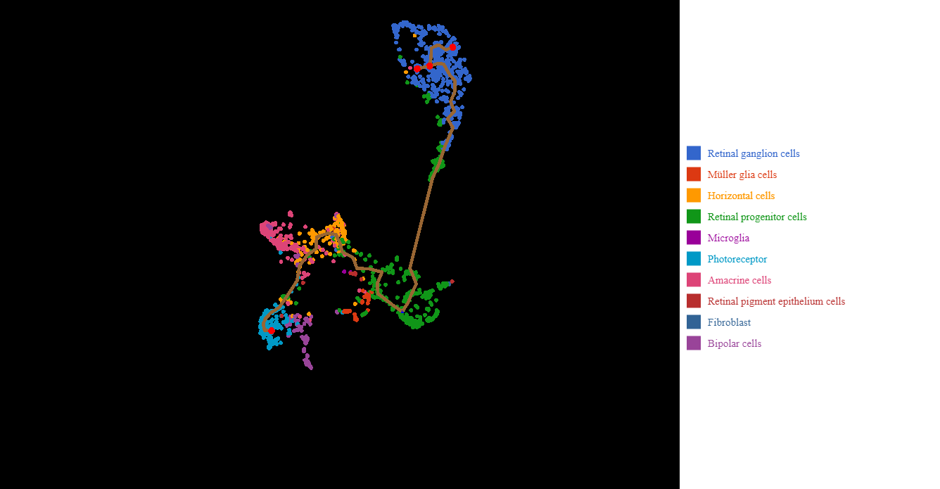
Figure 3. BBrowser Trajectory Analysis based on UMAP visualization of retinal progenitor cells into other retinal cells
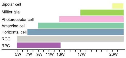
Figure 4. The temporal order of the generation of human retinal cells (originally Figure 2D, Hu et al., 2019). RPC: retinal progenitor cells, RGC: retinal ganglion cells
Take Away
- t-SNE and UMAP are both non-linear, graph-based methods for dimensionality reduction in scRNA-seq analysis.
- t-SNE and UMAP are both for data visualization. They are not meant to tell you about clustering or variation as much as methods like PCA do.
- t-SNE and UMAP have the same principle and workflow: create a high dimensional graph, then reconstruct it in a lower dimensional space while retaining the structure.
- t-SNE moves the high dimensional graph to a lower dimensional space points by points. UMAP compresses that graph.
- Key parameters for t-SNE and UMAP are the perplexity and number of neighbors, respectively.
- UMAP is more time-saving due to the clever solution in creating a rough estimation of the high dimensional graph instead of measuring every point.
- UMAP gives a better balance between local versus global structure, thus overall gives a more accurate presentation of the global structure. This will come in handy in trajectory analysis.
Closing
t-SNE and UMAP are not perfect and should not be treated as the miracle elixir. Since they both try to fit a high dimensional graph to a lower dimensional space, distortions being introduced into the final graph is consequential, thus raising skepticism about their efficiency. A recent preprint claims that both introduce much more distortion into the data than previously known and should not be used in scRNA-seq data visualization! What’s your thought? Let us know in the comment.
Meanwhile, scientists are still developing t-SNE and UMAP for better performance and to adapt to ever-changing scRNA-seq datasets. We can hope that soon we can welcome newer methods that address t-SNE’s and UMAP’s limits, just like how UMAP brings out many advancements 10 years after the publication of t-SNE.
Have we answered your questions? Let us know how we can help in the comment.
To assist your learning, we got in touch with the fathers of t-SNE and UMAP. Watch our webinars and hear more about them here: UMAP vs t-SNE.
References
- Van der Maaten, L., & Hinton, G. (2008). Visualizing data using t-SNE. Journal of machine learning research, 9(11).
- McInnes, L., Healy, J., & Melville, J. (2018). Umap: Uniform manifold approximation and projection for dimension reduction. arXiv preprint arXiv:1802.03426.
- Becht, E., McInnes, L., Healy, J., Dutertre, C. A., Kwok, I. W., Ng, L. G., … & Newell, E. W. (2019). Dimensionality reduction for visualizing single-cell data using UMAP. Nature biotechnology, 37(1), 38-44.
- Xiang, R., Wang, W., Yang, L., Wang, S., Xu, C., & Chen, X. (2021). A comparison for dimensionality reduction methods of single-cell RNA-seq data. Frontiers in genetics, 12.
- Kobak, D., & Berens, P. (2019). The art of using t-SNE for single-cell transcriptomics. Nature communications, 10(1), 1-14.
- Ma, L., Hernandez, M. O., Zhao, Y., Mehta, M., Tran, B., Kelly, M., … & Wang, X. W. (2019). Tumor cell biodiversity drives microenvironmental reprogramming in liver cancer. Cancer cell, 36(4), 418-430.
- Song, Q., Hawkins, G. A., Wudel, L., Chou, P. C., Forbes, E., Pullikuth, A. K., … & Zhang, W. (2019). Dissecting intratumoral myeloid cell plasticity by single cell RNA‐seq. Cancer medicine, 8(6), 3072-3085.
- Maynard, K. R., Collado-Torres, L., Weber, L. M., Uytingco, C., Barry, B. K., Williams, S. R., … & Jaffe, A. E. (2021). Transcriptome-scale spatial gene expression in the human dorsolateral prefrontal cortex. Nature neuroscience, 24(3), 425-436.
- Hu, Y., Wang, X., Hu, B., Mao, Y., Chen, Y., Yan, L., … & Tang, F. (2019). Dissecting the transcriptome landscape of the human fetal neural retina and retinal pigment epithelium by single-cell RNA-seq analysis. PLoS biology, 17(7), e3000365.
- Chari, T., Banerjee, J., & Pachter, L. (2021). The specious art of single-cell genomics. bioRxiv.
- Canzar, S. (2021). A generalization of t-SNE and UMAP to single-cell multimodal omics. Genome Biology, 22(1), 1-9.
James Melville
Minor correction: the main text refers to the UMAP reference as “(McInnes and Melville, 2018)”, but the citation should be “(McInnes et al., 2018)”. Or if you want to omit an author’s name please leave mine off and add John Healy’s back 😀 (the reference list itself is correct).
Minh-Hien Tran
Thanks for your keen eye. We have edited the in-text citation as you suggested 😀