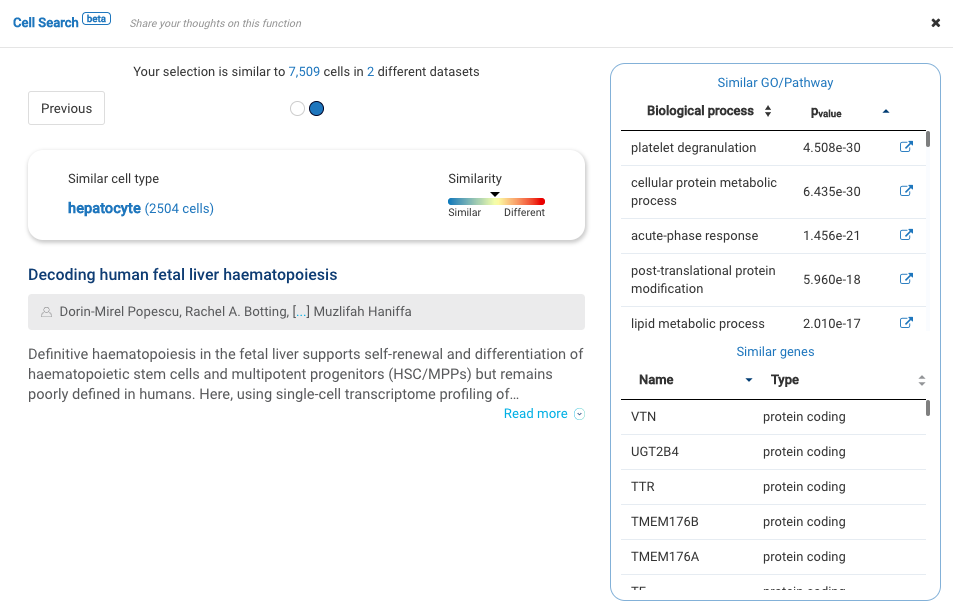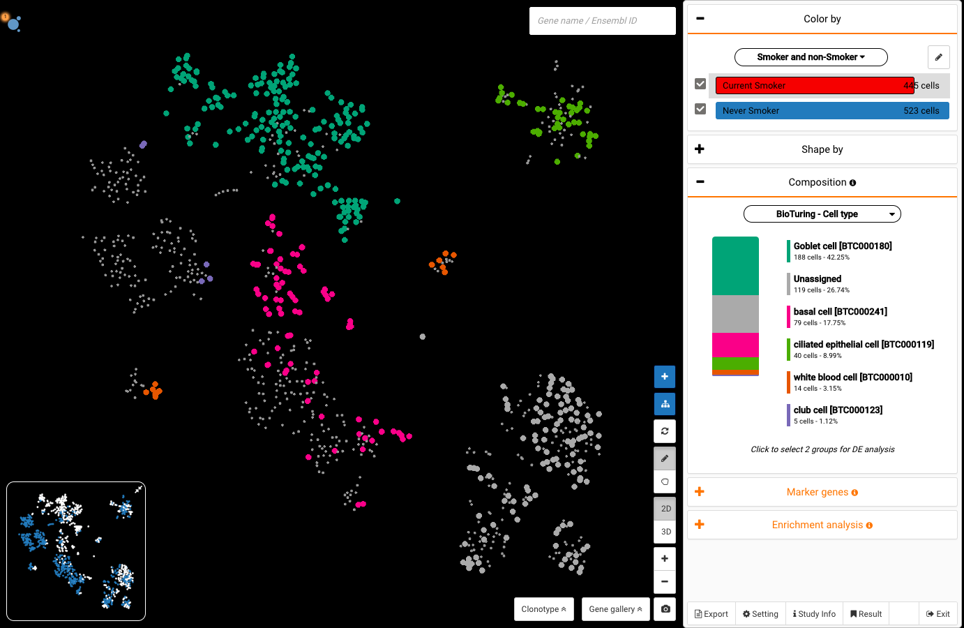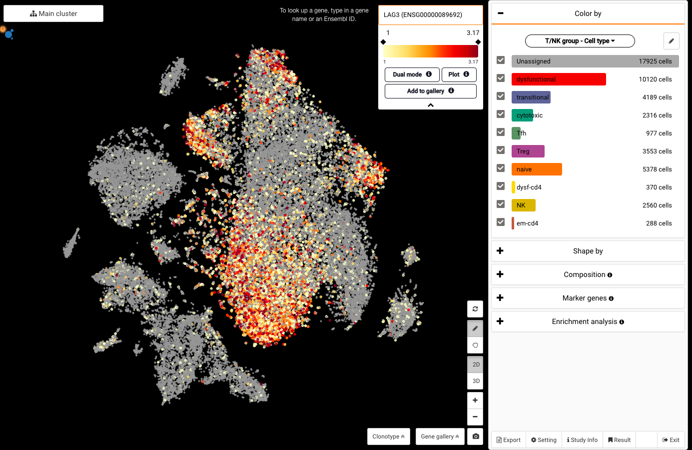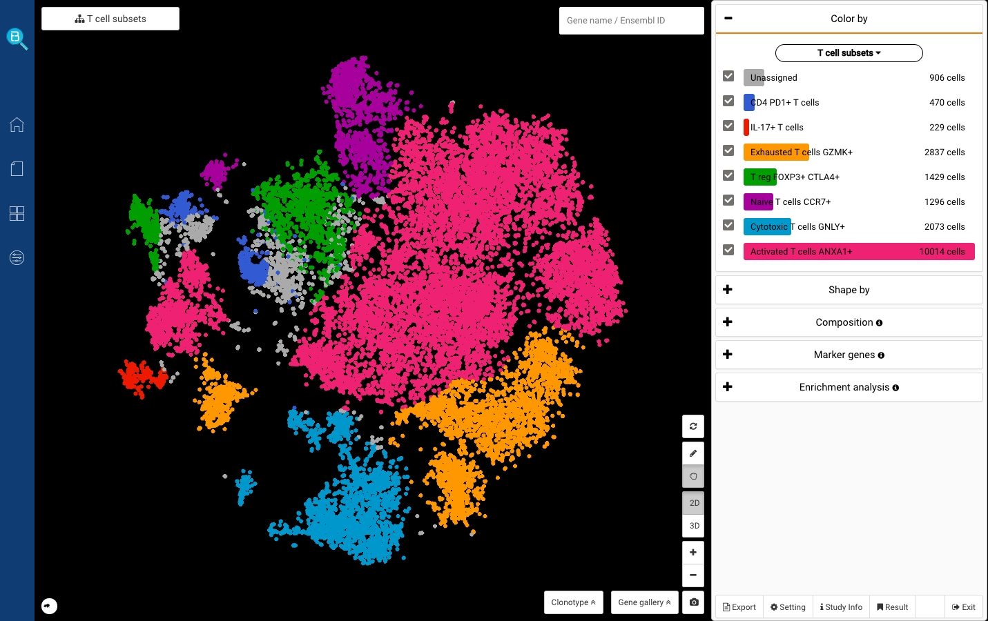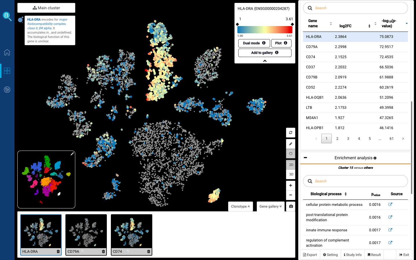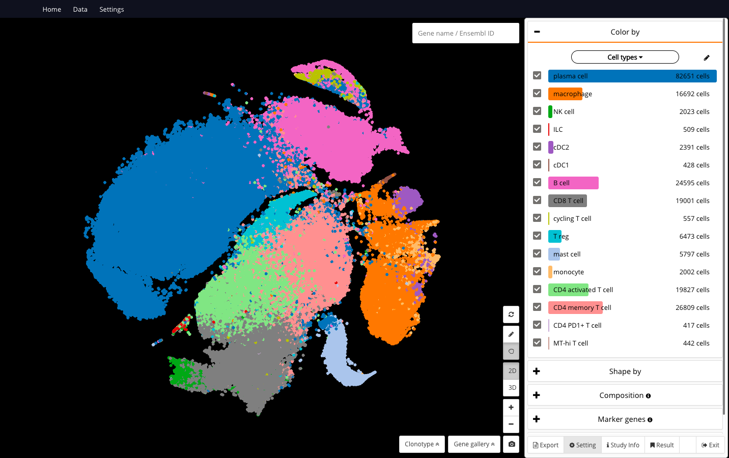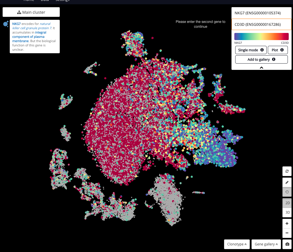
Interactive CITE-Seq data analysis with BioTuring Browser
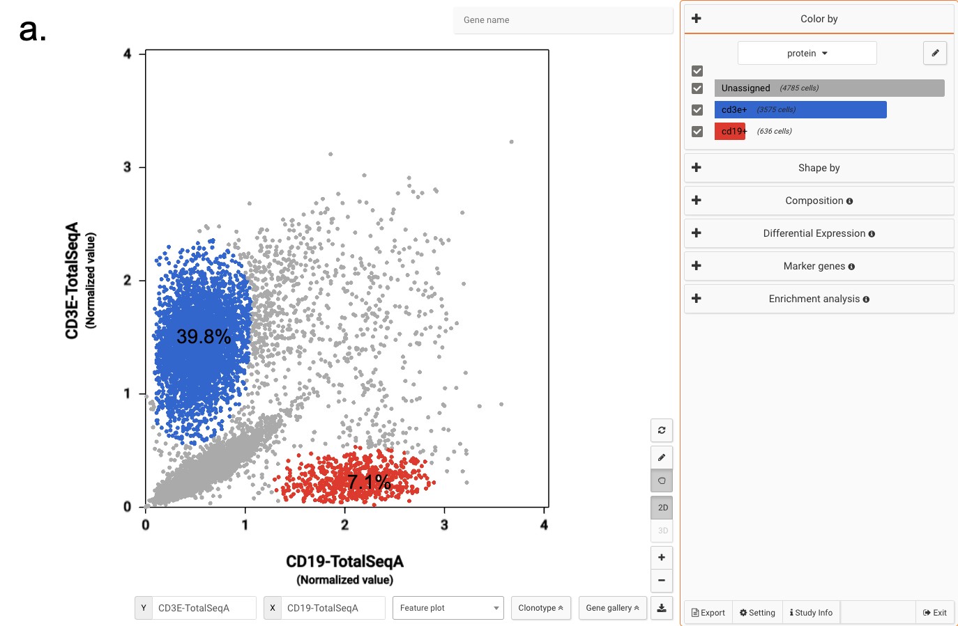
Nominated as Method of the year by Nature in 2019, single-cell multimodal omics has enabled scientists to uncover many facets of the cells by simultaneously measuring multiple modalities in one single-cell experiment. One candidate for multimodal analysis is CITE-Seq, a technique that layers cell surface protein information on top of […]